How to improve your website speed by optimizing fonts
Learn how to speed up your website by optimizing fonts. This guide covers smart font choices, reducing file size, using system fonts, and improving load times without sacrificing design quality.
Fonts are a core part of any website’s visual identity. They set the tone, shape the user experience, and help establish brand personality. With so many beautiful typefaces available online, it’s easy to get carried away choosing the perfect look. But while fonts are often picked for their aesthetics, they come with technical baggage that many people (especially non-developers) tend to overlook.
Lesser-known fact: fonts can take up a lot of space on your website. In fact, font usage is one of the most underrated culprits behind slow load times. Every custom font you add introduces extra HTTP requests, increases page weight, and delays how quickly your content appears.
Unlike images or videos, fonts often fly under the radar during performance audits, even though they quietly impact core metrics like Largest Contentful Paint (LCP) and First Contentful Paint (FCP). Just take a look at this section from a Pingdom speed test I ran on a client’s site. Fonts alone were adding hundreds of kilobytes after a rebrand.
So can you do something about it? Absolutely. Read on to learn how to prevent fonts from slowing down your site without sacrificing style or readability.
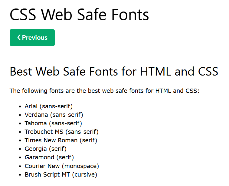
The fonts you use on your website typically fall into two categories: "web-safe fonts" and "web fonts". Web-safe are built into most devices (e.g. Mac and Windows) by default, so a visitor’s browser doesn’t need to download anything extra to display your content. As a result, web-safe fonts load fast and efficiently. Some examples of web-safe fonts include Arial, Times New Roman, and Georgia.
The problem is, web-safe fonts are extremely limited in number. For this reason, most modern websites rely on "web fonts". These are fonts that aren’t pre-installed on a device and must be downloaded from the internet when someone visits your site. They’re popular because they offer more variety and can be tailored to match a brand’s unique vibe. Some of the most widely used web fonts these days include Inter, Poppins, Open Sans, Raleway, Futura, and Proxima Nova.
The downside of web fonts? Every time someone visits your site, their browser needs to fetch these fonts from an external source before the content can be fully rendered. That introduces delays and adds to your page size, especially if you’re using multiple font weights and styles (we’ll dive into this in more detail in a bit).
So here’s the tradeoff: If typography isn’t central to your brand identity, sticking with system fonts is a quick and easy way to improve performance. You’ll save on file size and boost load times with zero extra work. But if you do need the flexibility and aesthetic range that web fonts offer, don’t worry, there are still smart ways to optimize them. We’ll cover those next.
2. Opt for "sans-serif fonts" instead of "serif fonts"
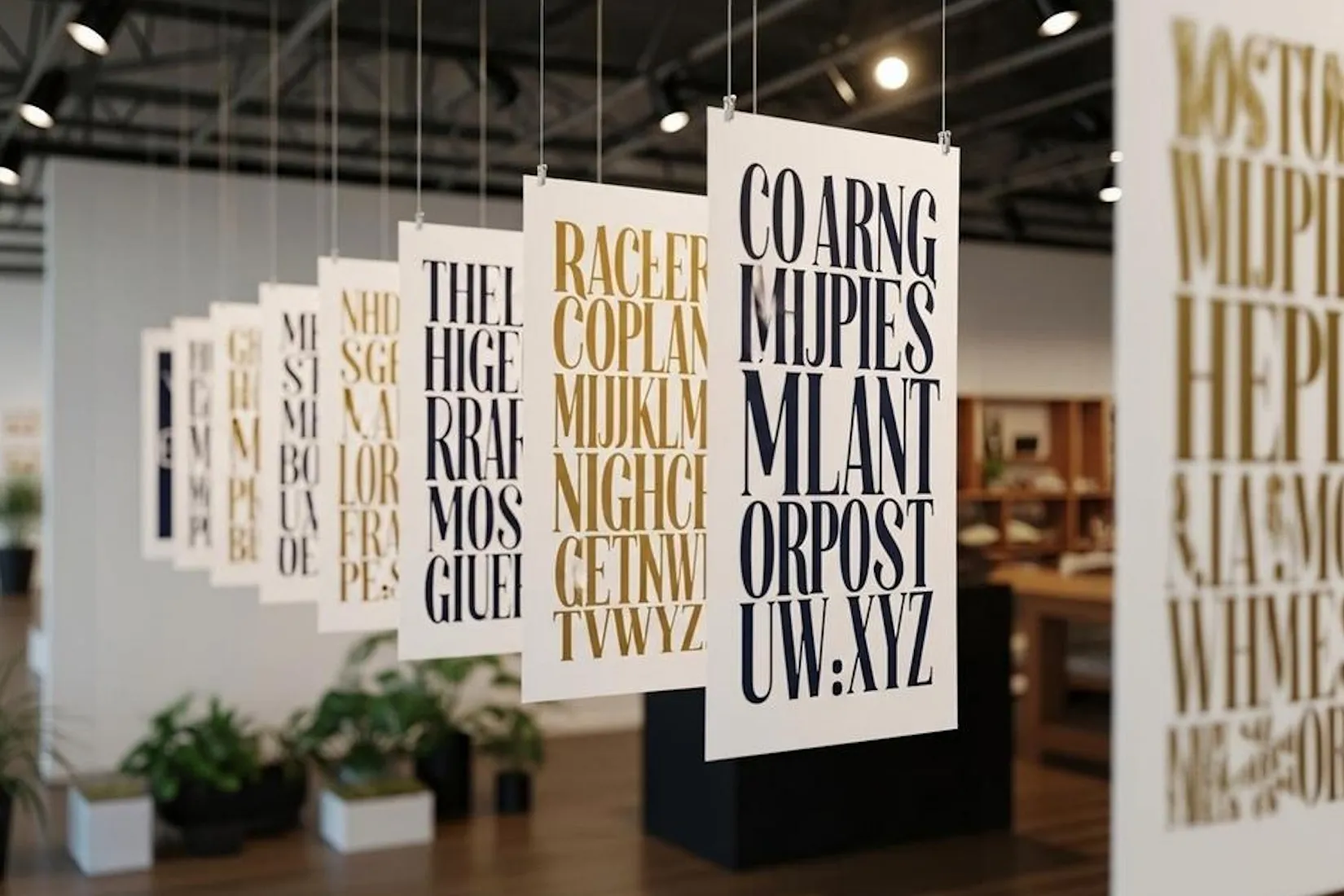
What’s the difference? Serif fonts have decorative strokes (or “tails”) at the ends of letters, while sans-serif fonts have clean, straight lines with no extra embellishments. See a side-by-side comparison below.
Sans-serif (left) vs. Serif (right) - Photo from Adobe
Fonts are essentially made up of glyphs (combinations of vector shapes) that represent letters or symbols. Serif fonts tend to have more glyphs compared to sans-serif fonts because they include those small decorative strokes on the letters, which are really just extra vector shapes. And these additional shapes increase the size of the font file.
When optimizing your website for speed, opting for sans-serif fonts over serif fonts can make a significant difference. Sans-serif fonts, such as Roboto, Lato, or Montserrat, have a clean and simple design, with no decorative strokes or serifs at the ends of the letters. This minimalist style makes them lighter in file size and faster to load. In contrast, serif fonts like Merriweather or Playfair Display contain additional decorative elements (the serifs), which require more vector shapes to render. These extra details can make serif fonts larger and slower to load.
3. Stick to one font family
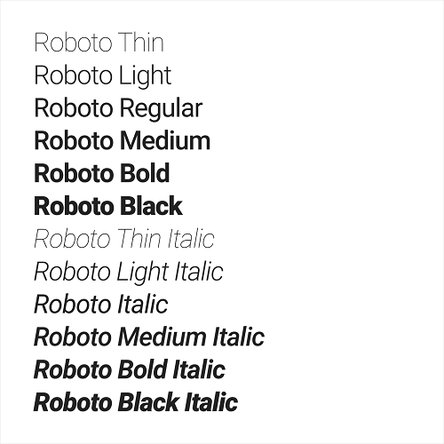
What’s a font family? It's just a group of related font styles that share the same basic design but vary in weight, style, or width. For example, the Roboto font family includes styles like Roboto Regular, Roboto Bold, Roboto Italic, and Roboto Light.
Roboto font family, showing the different font weights and styles
It’s tempting to mix and match fonts. One for headings, another for body text, maybe even a third for accents….but using multiple font families can quickly bloat your site. Every new font you add means another font file for the visitor’s browser to load, which increases load time and affects performance. From a speed perspective, sticking to a single font family keeps things lightweight and efficient.
But there’s a design benefit too: using just one well-chosen font family helps maintain visual consistency across your site. This is especially helpful if you’re not a designer. Many modern font families come with a wide range of weights and styles, like regular, medium, semi-bold, and bold, which give you enough variety for hierarchy (like headings vs. body text) without needing to reach for a second or third font.
In short: one good font is often better than three average ones. You’ll keep your design clean and your load times short.
4. Limit the number of font variants
Sticking to one font family is a great start, but there’s one more thing that can quietly slow down your site: using too many font variants.
Variants refer to things like font weights (thin, regular, bold) and styles (italic, oblique). Each of these adds a separate font file, and the more variants you load, the heavier your site gets. Even if they’re all from the same font family, your browser still has to fetch each one. That adds up fast, especially on slower internet connections.
Here’s the good news: you usually only need regular, italic, and bold for most websites. That’s enough to createclear hierarchy between headings, paragraphs, and emphasized text. So if you’re using a font like Roboto (the one shown above), you don’t need to load every version from thin to black. You can just use the ones you’re actually using in your design.
Now, you might be wondering: “How do I even choose which font variants to load on my site?” Especially if you’re using tools like Webflow, WordPress, or Framer where it’s not always super obvious. Don’t worry, I’ve been there too. The next step is all about uploading your own font files, which gives you more control over exactly what gets loaded, and how fast. It’s easier than it sounds, and I’ll walk you through it.
5. Upload custom font files
Now that you know why loading only the necessary font variants matters, let’s walk through how easy it is to upload custom web font files to your website. I’ll be demonstrating how to do this using my favorite website builder, Webflow as the example here, but the general idea is similar for other platforms too. Let’s go with the popular Poppins font for this guide, but feel free to choose any font that fits your brand.
Step 2: Type Poppins into the search bar. You will be directed to this page.
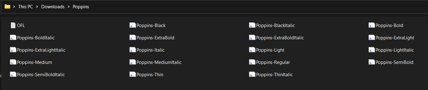
Step 3: Click "Get Font" on the right hand side. This will download all the Poppins font files as a .zip folder. Unzip it to see the font files inside.
18 variants downloaded for the Poppins font family
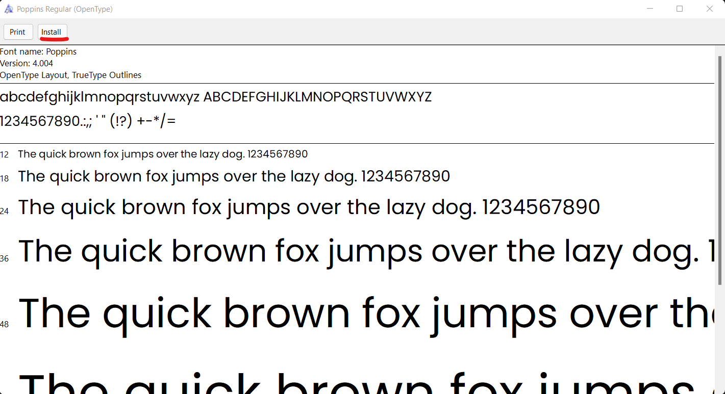
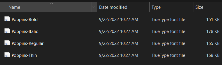
Step 4: The Poppins family has 18 variants, but we don’t need them all. Let’s keep it lightweight with just Light, Regular, Italic, and Bold. That’s plenty for most websites. Open these 4 font files (usually in .ttf format), and click Install in the top-left corner. This adds the font to your system so you can easily upload it to Webflow. [Pro tip: You can also check the file size of each font variant here—just right-click the file and select Properties (on Windows) or Get Info (on Mac). This gives you a clear idea of how much weight each font will add to your website, helping you make informed decisions before uploading.]
Click "Install" in the top-left corner to add it to your system
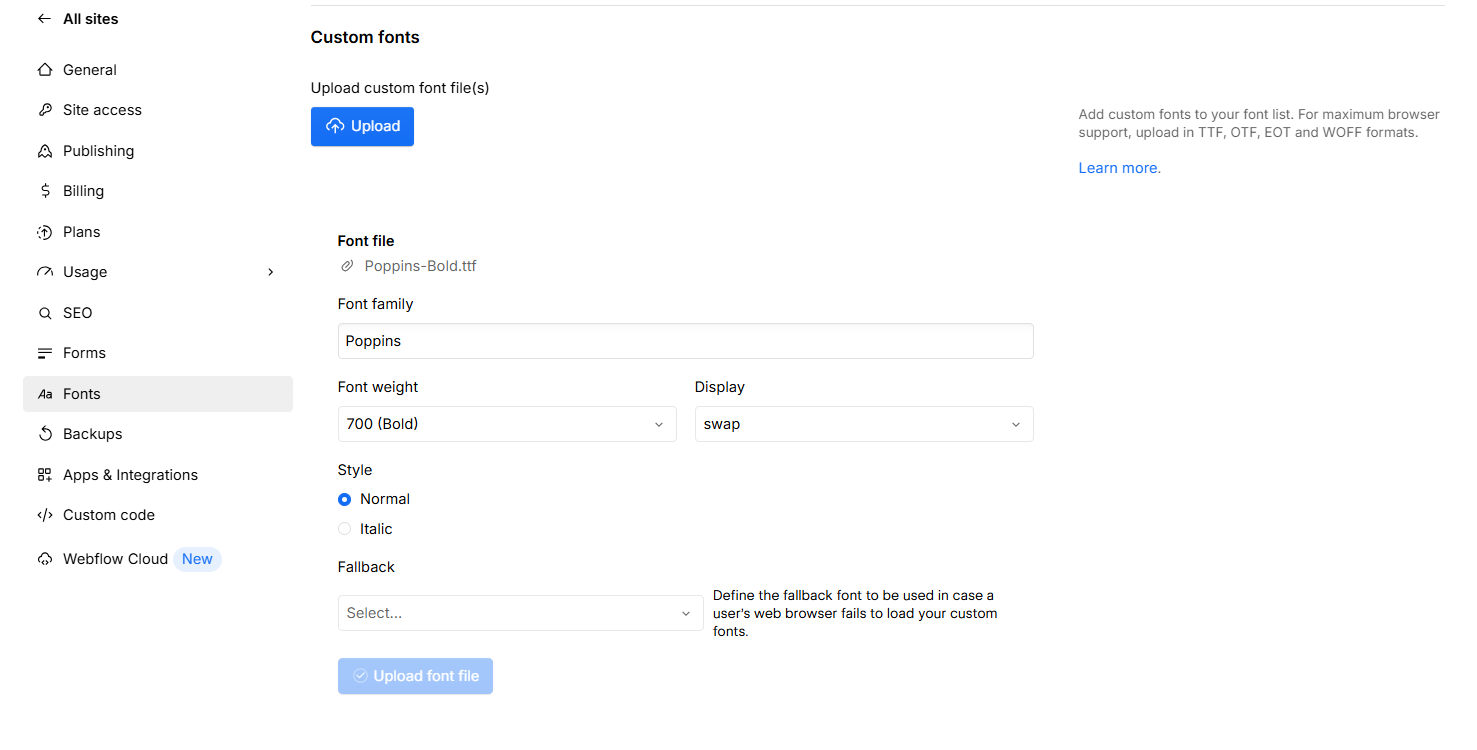
Step 5: In your Webflow Site Settings, go to the Fonts tab.
Step 6: Under Custom Fonts, click to upload each font variant you just installed. [Troubleshooting tip: If you can’t find the font files in your Downloads folder, it’s likely because your computer saved them elsewhere when you installed them. On Windows, check C:\Windows\Fonts. On Mac, check /Library/Fonts/ or search for the font name directly]
Upload the selected font variants into Webflow
That’s it! Your custom font is now ready to use in your Webflow project. Because you only selected the necessary variants (instead of uploading all 18), your font won’t bloat your website unnecessarily, helping you keep things fast, lightweight, and optimized from the start.
6. Set the right font display settings
Now that you’ve learned how to upload your own custom font files, there’s one more important step: setting proper font display settings. This controls how your text behaves while your web fonts are loading.
Ever seen this warning in a Google PageSpeed report? “Ensure that text remains visible during webfont load”.
This happens when a browser hides your text while waiting for the web font to load, something Google considers a poor user experience. On slower connections, it can leave users staring at a blank page, which isn’t great for engagement or SEO.
To avoid this, you’ll want to use the setting font-display: swap. What this does is tell the browser: “Hey, if the web font isn’t ready yet, show a fallback font for now—don’t leave the text blank.” Once your web font loads, it’ll automatically swap in.
If you’ve uploaded your custom fonts in Webflow, the display will be set to "swap" by default as you can see in the image above. However, always check to make sure it is configured this way. By doing so, you ensure your text is always visible, even during loading. This small step makes a big difference, especially for visitors on slower connections or mobile devices.
7. Compress font files (the ultimate game changer!)
Wait, what? You can compress fonts?! We all know we should compress images before uploading them to a website (I cover that in this post if you’re curious) but fonts too? Yep. And it can make one hell of a difference!
Here’s the secret: font files (like those Poppins variants you downloaded earlier) come packed with a ton of extra stuff: special characters, symbols, and entire language sets you’ll probably never use on your site. By default, these files are bloated with glyphs you don’t need.
But you can fix that. By removing unused characters like Cyrillic, Vietnamese, or mathematical symbols, you can shrink your font file size dramatically without touching the characters your site actually uses. The result? Faster loading, smaller file sizes, and no loss in visual quality.
Note that you need to compress the font files before uploading them to Webflow. Also, if you would like to watch a video tutorial and follow along, here is a video I found helpful.
Take the four Poppins font variants that we downloaded as an example. Notice that, although we just selected four variants, the total size of the four variants is still 642 KB which may not seem that big but is enough to slow down your website! Remember, every kilobyte counts! If you are using a serif font or more variants of a font, the fonts will take up even more space.
Selected font variant weights and their file sizes
Step 1: The first thing you need is a free font editor. I use FontForge, an open source, free font editing software. Go to https://fontforge.org/en-US/ and follow the steps to download FontForge to your system.
Step 2: Click the exe file that is downloaded and follow the steps to run the software.
Step 3: Open the software. You should see this screen:
FontForge home screen
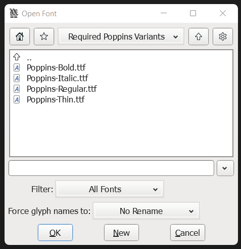
Step 4: Go to the folder where your font files are located.
Navigate to the location where the font files are stored on your system and select them
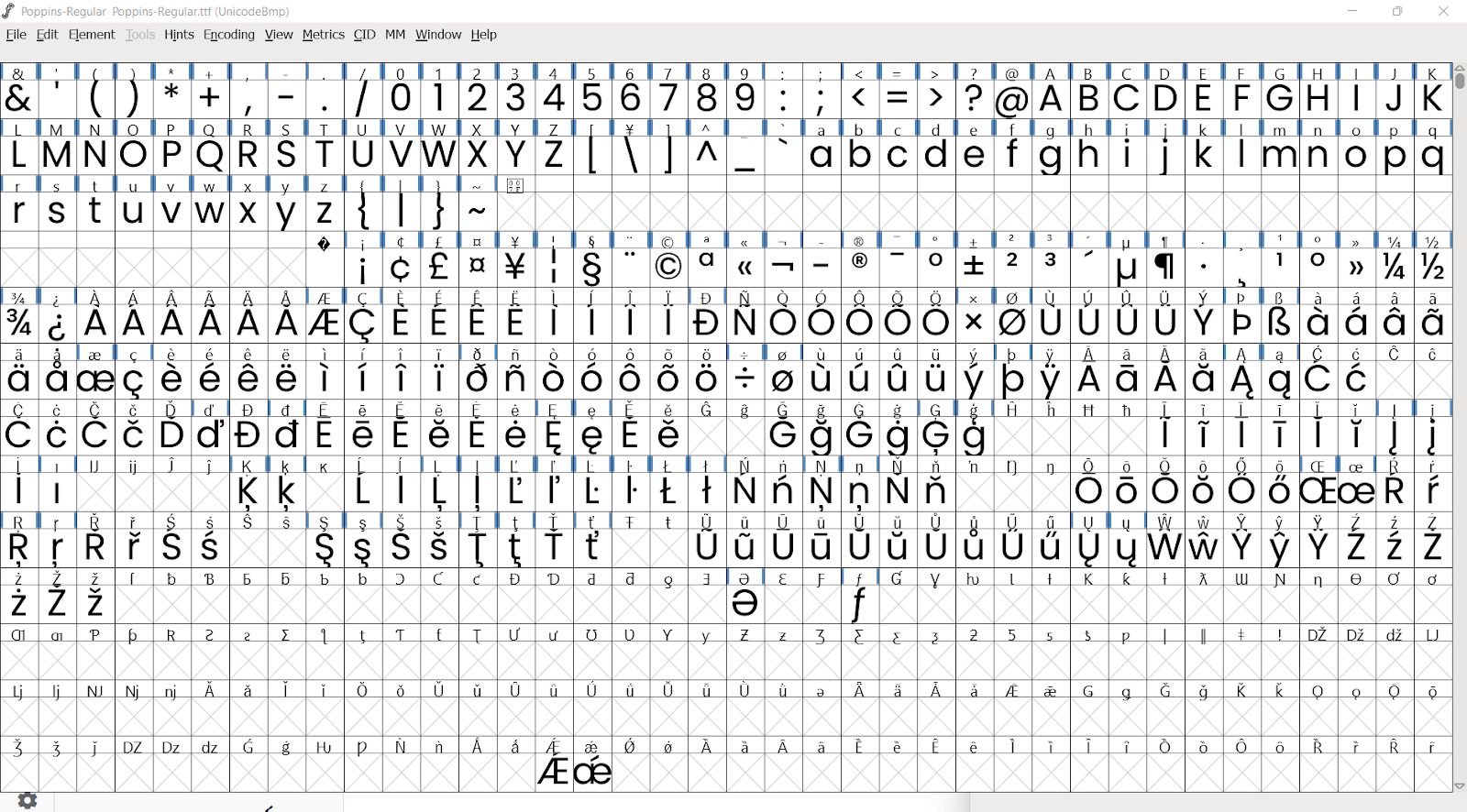
Step 5: Click a variant to get started. I’ve clicked the Regular variant and this is what shows up. You’ll notice that the first 3 rows contain the required alphabet, numbers and commonly used symbols. If you scroll down through the file, you’ll see this font file is actually huge. The remaining rows feature a whole bunch of special characters, symbols and letters in other languages that will never be used and will just end up bloating your font file.
How the open Poppins font file looks inside FontForge
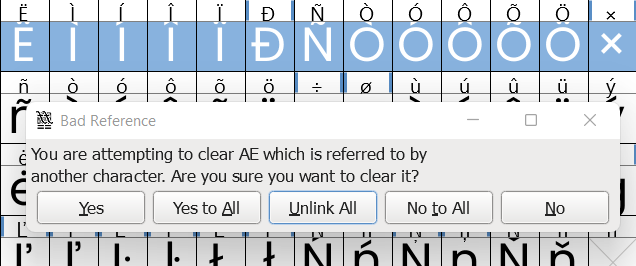
Step 6: You can delete these extra characters by right-clicking on the character and selecting “Clear”. To delete multiple characters at once, click and drag on multiple characters. Once they are selected, right-click and select “Clear”. You may see a warning. Go ahead and safely click "Unlink All".
Step 7: Keep scrolling through the file and deleting extra characters. You can do this quickly by simply clicking on one character and dragging your cursor down so you keep selecting more characters without having to do it one by one.
Note: When deleting letters or characters used in other languages like French, Spanish, etc., you don’t need to worry that your text won’t be visible to users in those countries. Even if your font file does not have the character in their language, the browser will automatically replace that character with one from the system font which you set as your “fallback” font as we discussed in the Use custom fonts instead of Google fonts and Adobe fonts section above.
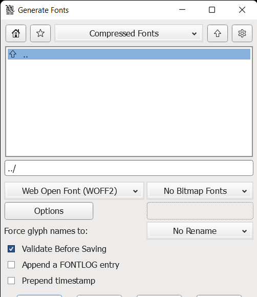
Step 8: Once you have removed all unnecessary characters, go to “File””on the top left corner and click on “Generate Fonts”. Leave all settings as they are. Just make sure the font format you are downloading is WOFF2. WOFF2 is the lightest font file format and compatible with most browsers. Save the font to a folder of your choice. I’m saving it to my folder called “Compressed Fonts”.
Save the fonts as WOFF2 files when done compressing them
Step 9: Repeat this process for all your font variants. In my case, by the end of this exercise, the total size of all four font variants was just 25 KB compared to the original 642 Kb!
Step 10: After your compressed font files are ready, go ahead and upload them as custom fonts in the “Fonts” section of your Webflow site settings as we saw in the previous section and you’re good to go!
After doing this, fonts should only be a very minimal size and not slow down your website at all!
TL;DR – How to optimize fonts for your website
Use system fonts where possible – they’re already on users’ devices and load instantly.
Choose sans-serif fonts over serif fonts – they’re simpler and usually come in smaller file sizes.
Stick to one font family – it keeps your design clean and reduces the number of files your site loads.
Limit font variants – only load the weights and styles you actually use (e.g. Regular, Bold, Italic).
Upload custom font files – gives you control over which variants are included and how they load.
Set font-display: swap – prevents text from being invisible while your web font loads.
Compress your font files – remove unused characters (like other language sets) to shrink file size.
Remember: Every font you load adds weight to your site. Load only what you need, and your website (and users) will thank you.
Over 300 businesses have used my templates to launch their websites faster and look more professional online. Go live in half the time and at a fraction of the cost of custom development, with one of my professionally designed and fully customizable website templates.