5 better ways to show testimonials and reviews on your website (that actually build trust)
Learn effective ways to display social proof on your website beyond logos and sliders. Explore high-converting formats like case studies, video testimonials, real stats, and authentic customer feedback.
I genuinely believe ratings and reviews are among the greatest inventions of the 21st century. We don’t usually trust a single stranger on the internet (or on the street) but the combined opinion of a thousand strangers? That’s a different story. It suddenly feels reliable and trustworthy. Like there's safety in numbers.
That’s the power of social proof and every business website needs it to build trust with their target audience and nudge people toward action.
When someone lands on your website, they’re asking a fundamental question “”Can you solve my problem? Have you done it before? For whom? And how did it go?” The way you present social proof should work to directly and confidently answer that question.
Most websites today include some form of social proof. But not all formats are created equal.
In this post, I’ll start by breaking down the familiar formats and the trade-offs that come with them. Then I’ll share 5 better, high-impact ways to showcase social proof that feel more authentic, more compelling, and in many cases, far more effective.
The 4 “go-to” social proof formats (and what they’re missing)
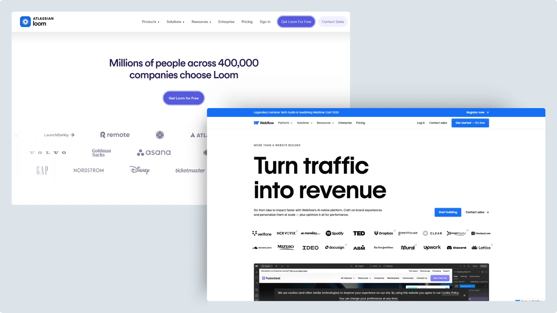
1. Client logos in a grid or marquee
Why these are popular
This is probably the most common format of showing social proof that you'll see on websites these days. Displaying client logos is quick and easy to implement. If you’ve worked with recognizable brands, showing their logos can create immediate credibility. It’s a way of saying, “Look who trusts us,” without needing many words.
Where this format falls short
If the logos aren’t from companies people recognize, the impact is minimal. For newer businesses or freelancers working with smaller brands, the logos might not mean anything to the average visitor. Now, if you’ve worked with Nike, Amazon, Google, or McDonald’s, great! Just showing those logos is probably all you need to make people trust you. But most businesses haven’t worked with global giants. They’ve worked with other small to mid-sized companies (often amazing in their own right) but with logos that don’t carry instant recognition.
And that, in my opinion, is the biggest limitation of this format. If your audience doesn’t recognize the logos, they don’t get the trust signal you’re hoping for.
Some examples of logo grids and sliders on websites: Loom and Webflow
Webflow templates with ready-to-use client logo grids or marquees
This format is visually tidy, easy to skim, and familiar to most website visitors. I use this on my own website as well. It's especially useful for highlighting short, positive quotes and gives a sense that multiple people have had a good experience.
Where this format falls short
These snippets can often feel cherry-picked and overly polished. Without knowing the full context (what the client’s problem was, what service was provided, how the problem was resolved) it’s hard for visitors to connect with the testimonial on a deeper level.
At the end of the day, people are coming to your site with one question in mind: “Have these people solved my problem for anyone else? If so, how?” And unfortunately, testimonial slides rarely do agreat job of answer that.
Also, the sad fact is that these days, even happy clients won't bother to write your testimonial themselves. They’ll get AI to do it, and yes, it's painfully obvious. I’d know. It has happened to me, and yes, I’m still mad about it.
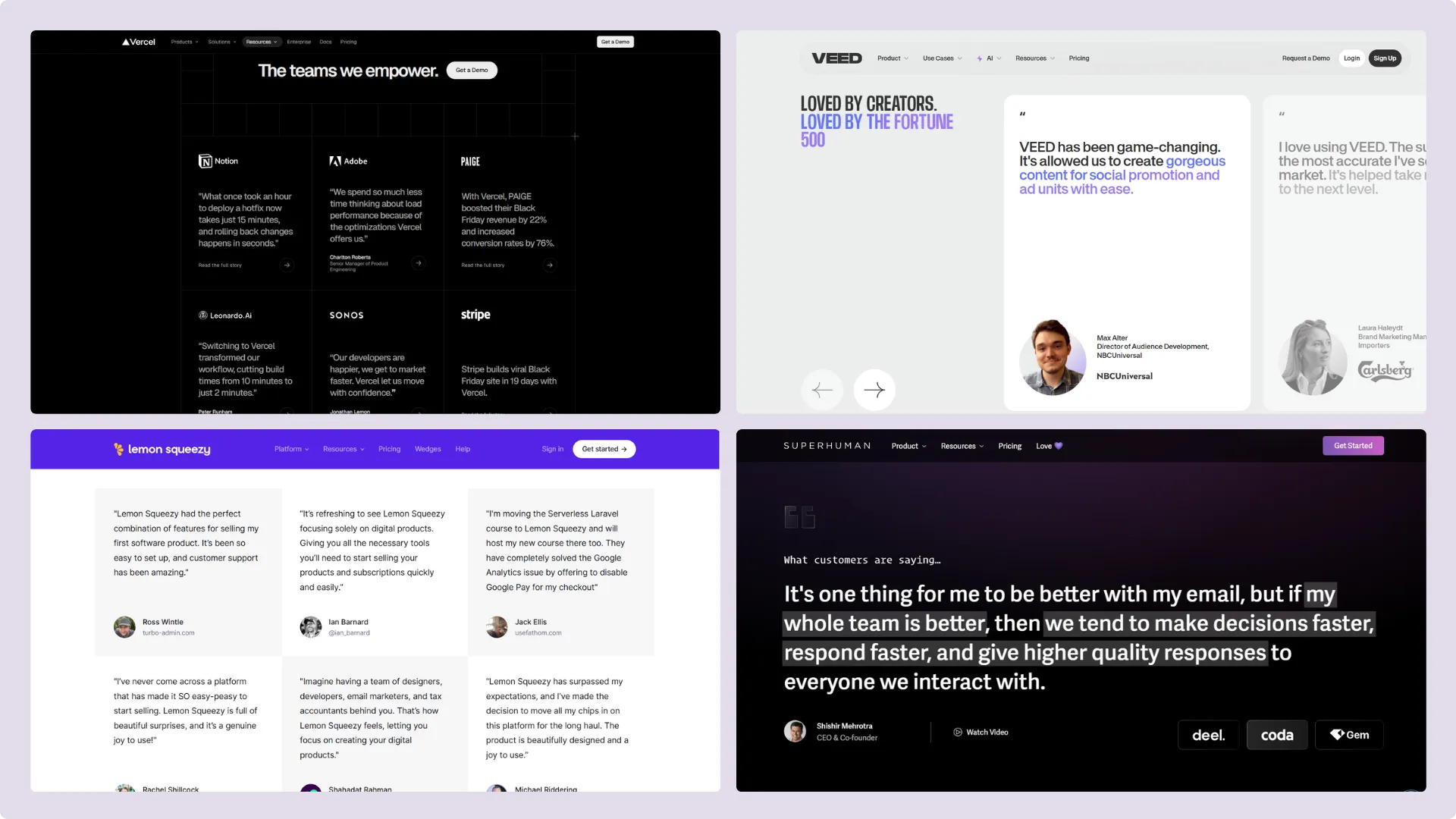
Some examples of testimonials on websites: Vercel, Veed.io, Lemon Squeezy and Superhuman
3. Star ratings from platforms like Google or Trustpilot
Why these are popular
Star ratings are immediately recognizable and deliver a quick hit of credibility. Seeing something like “4.9 out of 5 stars” across hundreds or thousands of reviews gives the impression of broad satisfaction and consistent quality. It’s also a format we’re conditioned to trust. Whether you’re looking for a great breakfast spot or deciding between two gyms near you, what’s usually the deciding factor? For me, it’s the Google reviews. Every. Single. Time.
Where this format falls short
Star ratings work best when you have a large number of reviews. That number is what does most of the heavy lifting when it comes to building trust. If you only have a handful of ratings, even if they’re perfect 5-stars, it won’t carry the same weight. So for relatively new businesses, this isn’t the most effective strategy on its own.
Another limitation: they rarely show who gave the review. That might be fine when you're choosing a restaurant or comparing gyms. But for B2B services, the source of the review matters a lot. A glowing 5-star rating hits differently when it comes from “Sarah Malik, Marketing Director at XYZ Co.”, versus just “Sarah Malik” with no details. That kind of detail matters, especially in a B2B setting where trust is built not just on what was said, but who said it.
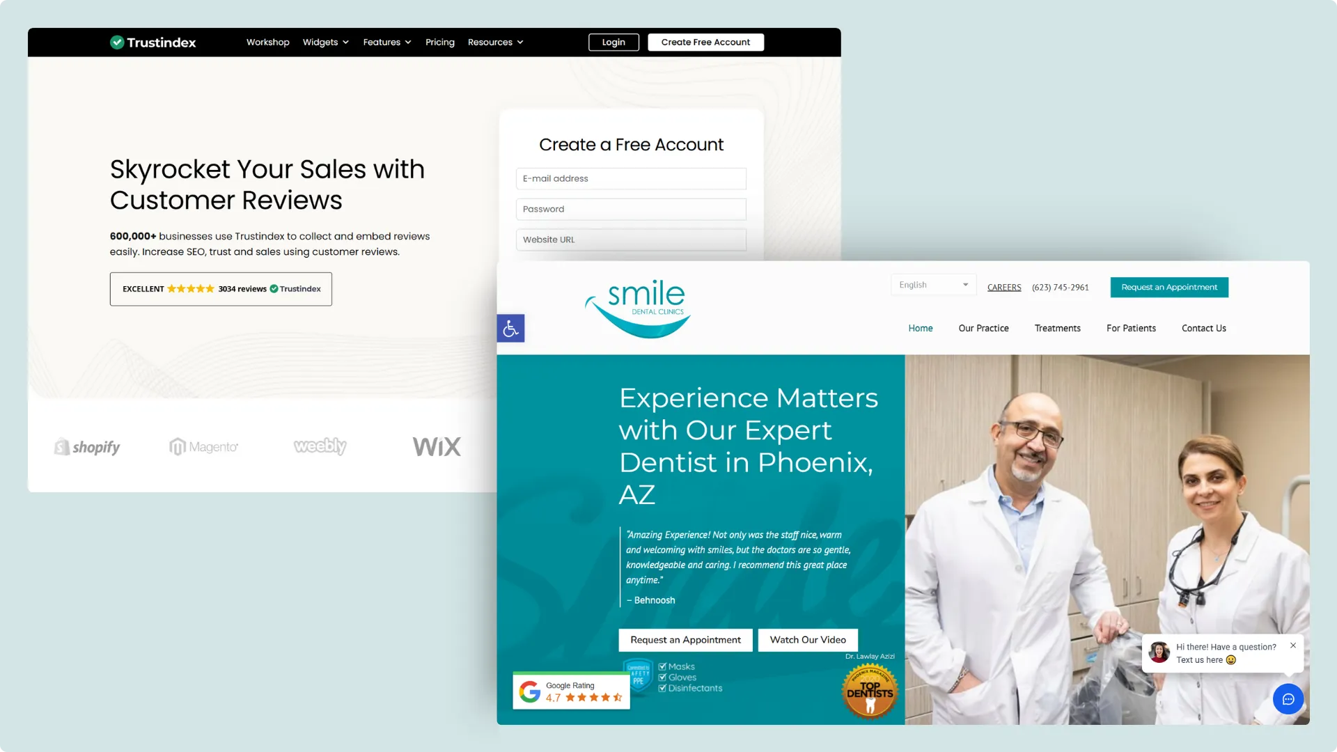
Some examples of star ratings in use on websites: Trustindex and Smile Dental Clinics
Templates with ready-to-use star ratings & reviews blocks
4. Statistics (e.g. “10,000+ users in 50 countries”)
Why these are popular
Like with star ratings, big stats are impressive and immediately signal success. Stats like user counts, countries served, or revenue milestones give visitors a sense that your business is established and widely trusted.
Where this format falls short
Stats like “10,000+ users” or “active in 50+ countries” are great for showing scale but they rarely show impact. Who are these users? What kind of businesses do they run? What results did they actually get from working with you or using your product?
Without that context, these numbers can feel abstract and impersonal. They sound impressive, but they don’t help a potential customer understand whether you can help them. It’s trust by volume but, again, with no story behind the numbers, it often falls flat.
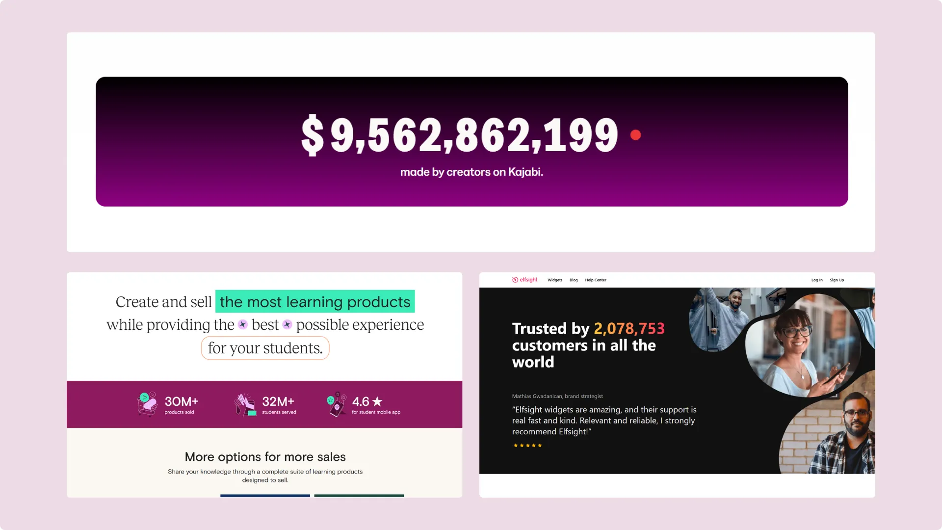
Some examples of statistics in use on websites: Kajabi, Teachable and Elfsight
Templates with ready-to-use statistics display for social proof
5 better ways to show social proof on your website
If you really want your social proof to stand out and feel genuine, these are the formats I recommend. They take more effort than a quick logo grid or quote slider, but they also do a much better job of answering the one question that actually matters to potential clients: “Have you solved this problem for someone like me?”
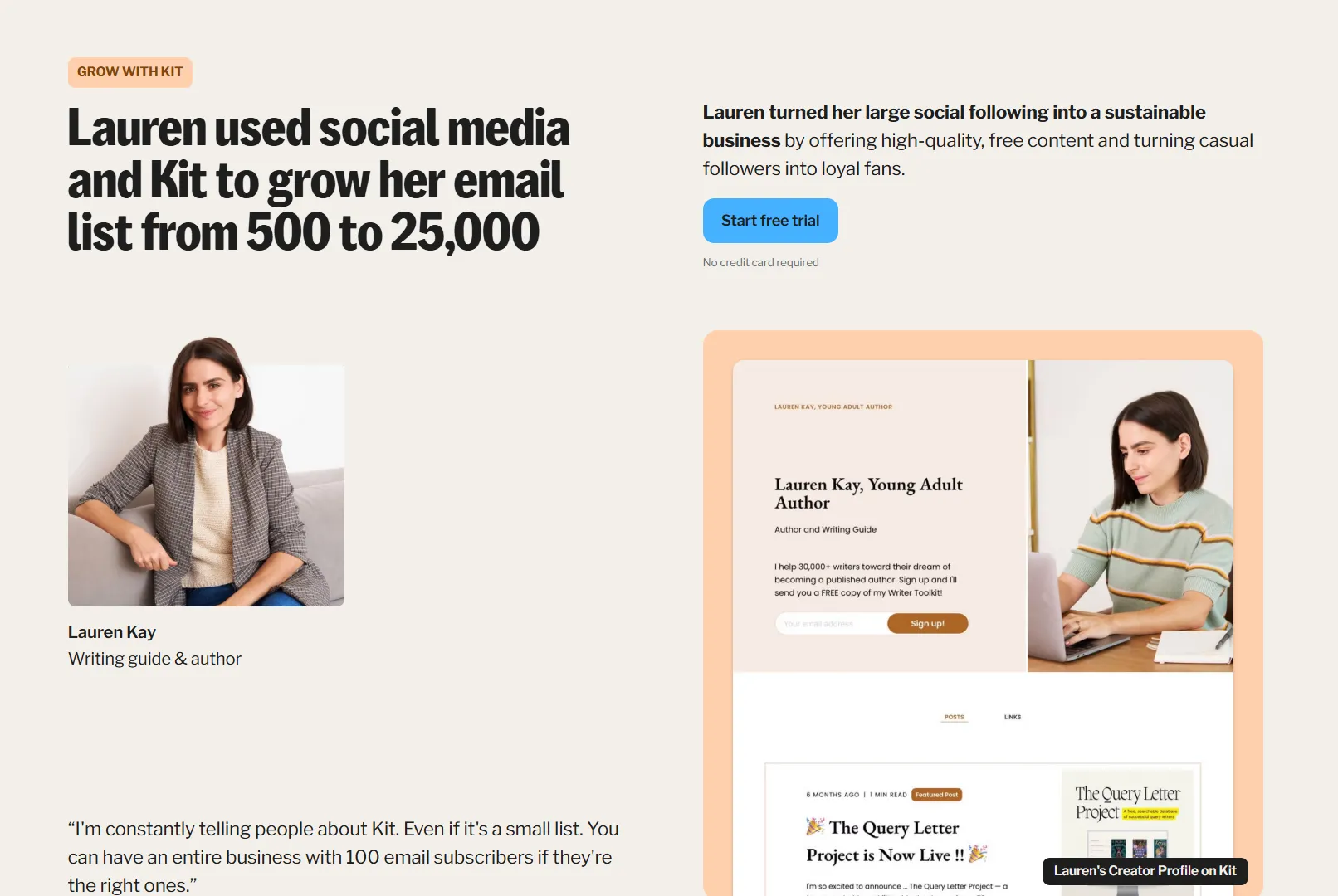
1. Case studies that tell a story
I know you’ve heard this one before but if there’s one format that consistently stands out to me (both as a designer and as a potential customer), it’s the humble case study. Yes, they take more effort to put together, but when done right, they’re incredibly powerful. Why? Because they show context, process, and results. You’re not just saying “Look, we made a client happy,” you’re showing why they were happy, and what it took to get there.
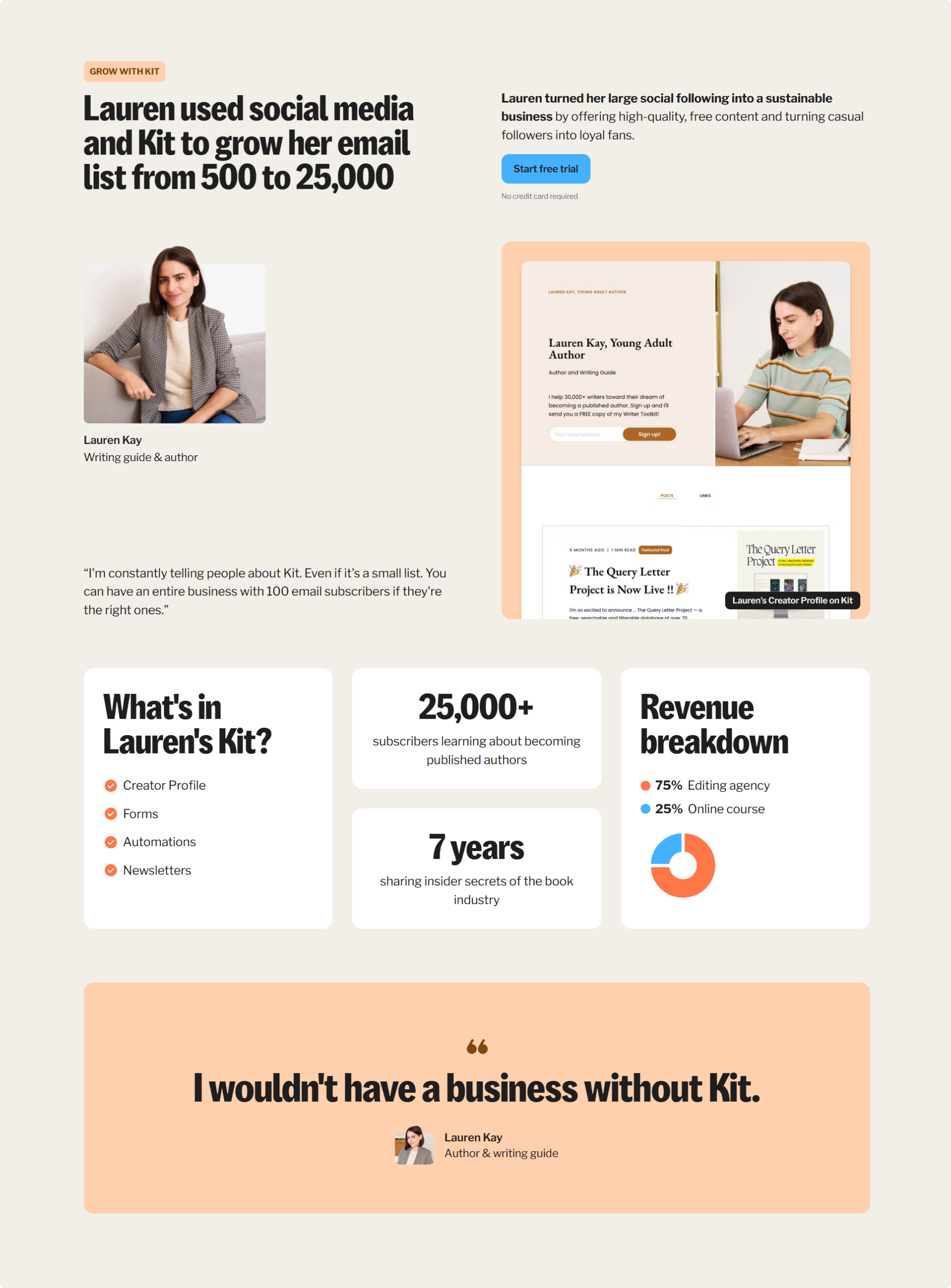
One of the best examples of this I’ve personally come across is Kit.com. I was in the middle of figuring out how to start my own newsletter when I found their site. I had never heard of them before, but it was their case studies that actually convinced me. They have real stories from creators, not just big names but also smaller people building and growing quietly but consistently. And these weren’t 1,000-word essays; they were short, visual snippets that made it very clear how Kit was helping people grow. That’s all I needed to know they could make it possible for me as well.
I have one case study on my own website right now, and I plan to add more soon. They take time to write (and yes, you do have to ask the client for a bit more input), but the return on effort is worth it. Even a short, 3-paragraph breakdown with a few visuals can go a long way.
My favorite example of case studies in use on websites: Kit
I’ll admit that this one’s not always easy to pull off. But when it works, it really works.
There’s something incredibly persuasive about watching a real person talk about their experience with a product or service. You hear their voice. You see their expressions. It’s personal, and it immediately feels more credible than a paragraph of polished praise in quotation marks.
We’re constantly scrolling through reels, shorts, and TikToks all day. So short-form video testimonials just feel natural. And they don’t need to be hyper-produced either. In fact, I’d argue that the more polished they are, the less authentic they feel. A quick, selfie-style clip of a client saying what problem they were facing, how you helped, and what changed for them…that's often all you need.
I haven’t included video testimonials on my own website yet, mostly because I haven’t asked for them. And to be honest, I’m not super comfortable on camera myself, so asking clients to do it feels a little awkward. But I’ve seen just how much more compelling even 2 or 3 short videos can be, compared to 10 written testimonials. If anything, that makes me want to get over my hesitation and just start asking.
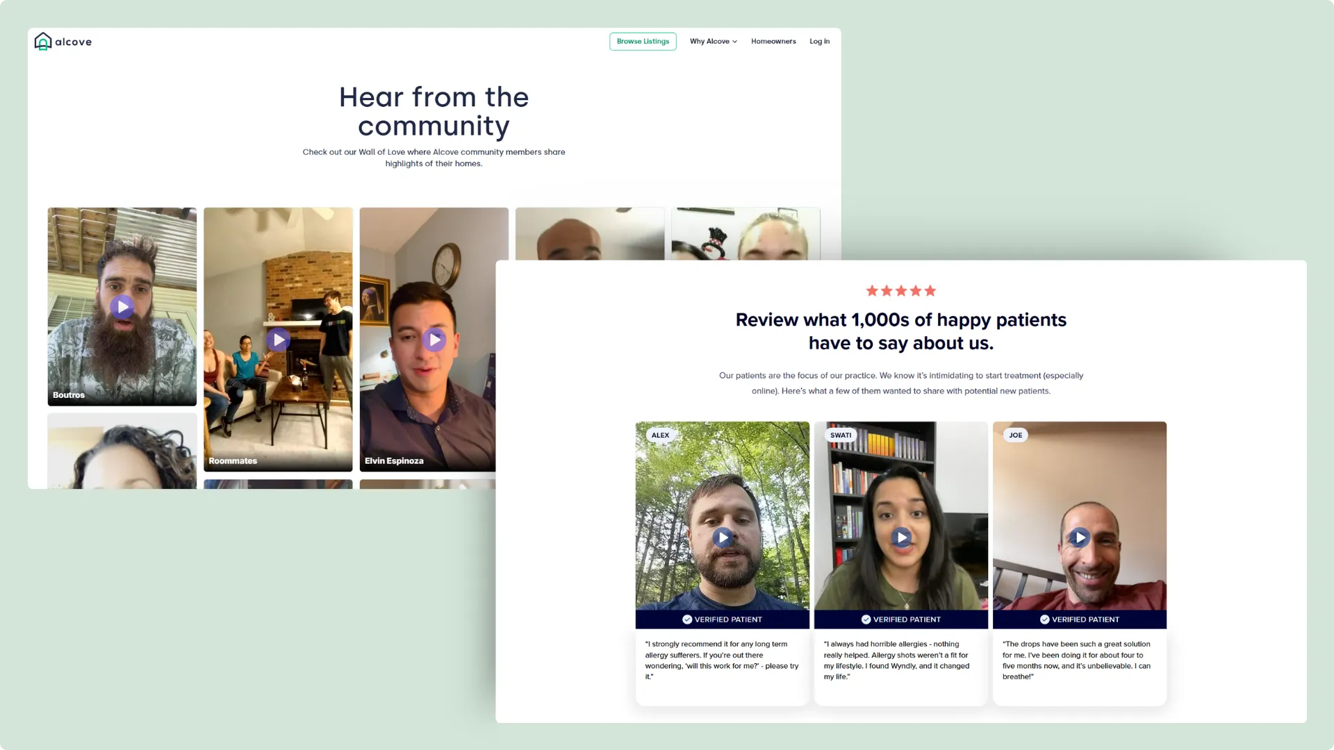
A great example of this is Alcove Rooms, a platform that helps people find long-term, furnished rooms in shared apartments. They have a full page on their website featuring short vertical video testimonials from real renters, and they’re refreshingly human. The videos are casual recorded on phones, sometimes with people sitting on their beds or standing in their new rooms and that’s exactly why they work.
Some examples of video testimonials (UGC-style) in use on websites: Alcove Rooms and Wyndly
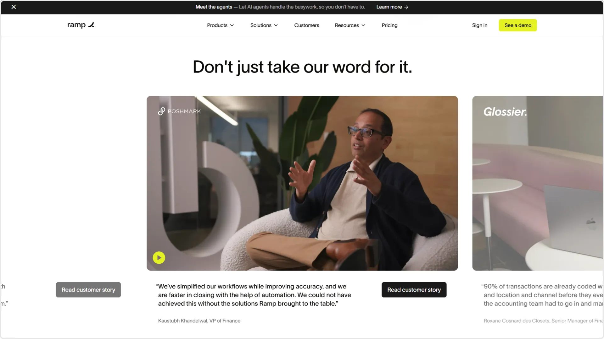
Ramp is another one to watch. Their customer stories page includes professional yet natural-looking videos from business leaders explaining how Ramp helped them save time or money. Each clip is tied to a specific outcome, which gives the testimonial weight, and makes it much easier for prospective users to imagine what it could do for them.
Example of a more professionally filmed and edited video testimonial on a website: Ramp
Moral of the story: if you’ve got even one client who’s comfortable recording a quick video...ask. A 30-second clip with genuine tone and body language can do more for trust-building than a dozen text quotes ever could.
3. Before & after showcases
I love this format because it taps into something very simple but powerful: transformation. Whether someone is buying skincare, hiring a web designer, or signing up for an SEO service, what they really want to know is: what’s going to change for me?
Before-and-after comparisons make that clear. You don’t need to say much when you can show a struggling “before” and a thriving “after.” It’s satisfying, it’s visual, and it instantly makes your work more believable.
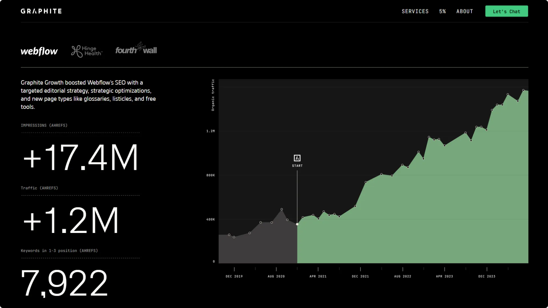
This is a format that’s been around forever, especially in industries like skincare, fitness, or home renovations, but I’ve seen it work just as well for digital services too. One of my favorite examples is Graphite, an SEO agency that doesn’t just name-drop clients. They go a step further and show exactly how their clients’ SEO metrics have improved since working with them, using simple, well-designed line charts. It’s clean, specific, and instantly communicates impact—no need to read paragraphs of explanation when the data tells the story for you.
Example of before-and-after social proof for an SEO agency: Graphite
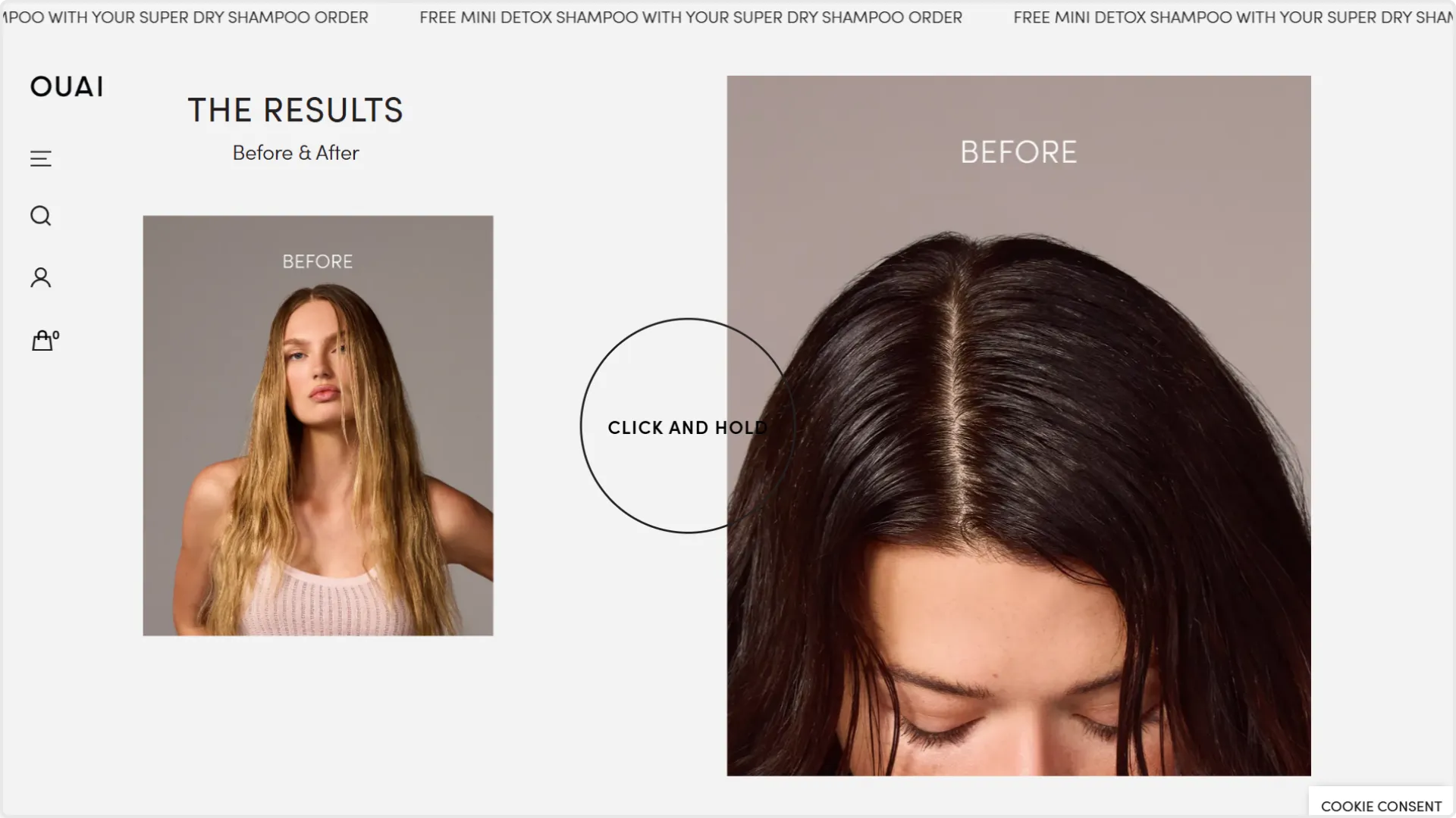
In product-based industries, you’ll see this a lot with brands like Ouai, Glossier or any hair or skincare brand that understands the power of visual proof. Side-by-side images of a customer’s hair or skin before using a product and a few weeks after? That kind of thing sells more effectively than any tagline ever could.
Example of before-and-after social proof on websiteL Ouai
4. Screenshots of real feedback
There’s something oddly powerful about a raw screenshot. A Slack message, a WhatsApp chat, an email reply from a client saying “This looks AMAZING”. It’s messy, unpolished, and very clearly real. And because it’s real, people trust it more.
You don’t need a fancy layout or testimonial plugin for this. You can literally drop the screenshot into your site with a subtle caption, or wrap it inside a styled testimonial section.
This approach also works well if you're active on social platforms. Someone replied to your LinkedIn post thanking you for your work? A happy customer DM’d you on Instagram after a project? Screenshot it. Crop it. Feature it (with their permission, of course). The best social proof often isn’t something you ask for. It’s something that comes to you naturally, in the middle of a conversation.
This form of social proof is still woefully underused on websites, maybe because it doesn’t look “polished” enough. Brands often worry it’ll seem lazy to post a raw screenshot instead of a nicely styled testimonial block. Personally, I’d argue the opposite. Just like with video, the more raw and unfiltered it looks, the more authentic it feels.
5. Popups that show real-time activity
This one’s a little different from the rest, but when used well, it can be surprisingly effective. I’m talking about those small, unobtrusive popups that say things like:
“Someone from Chicago just purchased the Pro Plan” “Emma just booked a demo 2 minutes ago”
You’ve probably seen these on SaaS sites, landing pages, or e-commerce stores. They’re designed to create urgency, but they’re also a form of social proof. They tell visitors: You’re not the only one here. People are buying, signing up, taking action. It’s a subtle nudge that makes your offer feel more legit and more in-demand.
This kind of social proof works because it taps directly into "FOMO" (the fear of missing out). It’s the same instinct that makes us curious about long lines outside a restaurant or popular products selling out. Real-time popups take that social cue and replicate it digitally. They let your visitors know that your product, service, or offer isn’t just sitting there...it’s in demand.
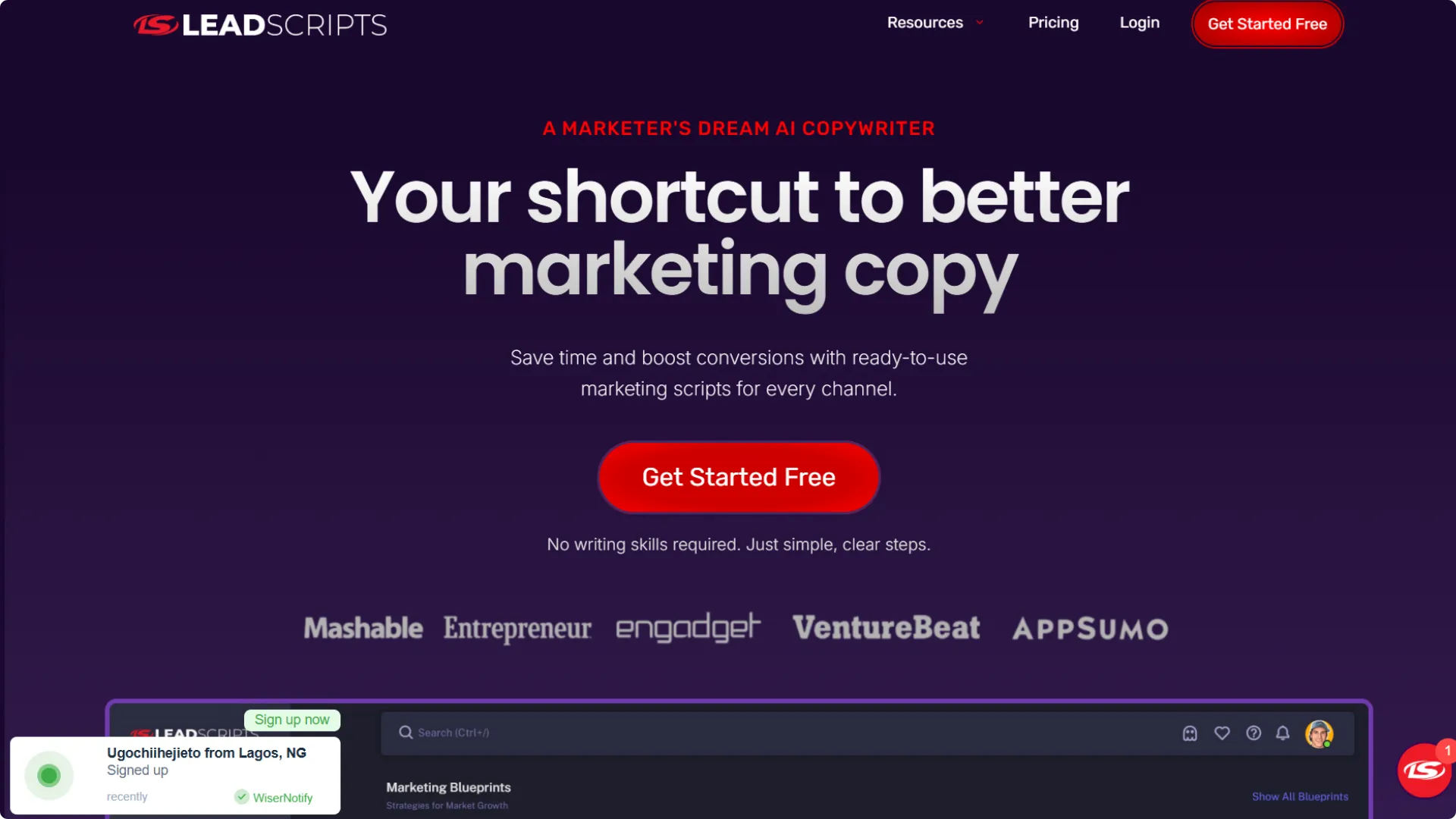
Check out this example from LeadScripts' website. Lead Scripts is a copywriting for marketers and entrepreneurs. On their homepage, you’ll notice small real-time popups (likely powered by Fomo or Proof) that say things like:
“Rubin Darby from New York signed up recently.”
Example of real-time activity popup on website: LeadScripts
These popups appear at regular intervals, subtly reinforcing the idea that people are actively buying and using the product—which adds both trust and a bit of urgency without being pushy.
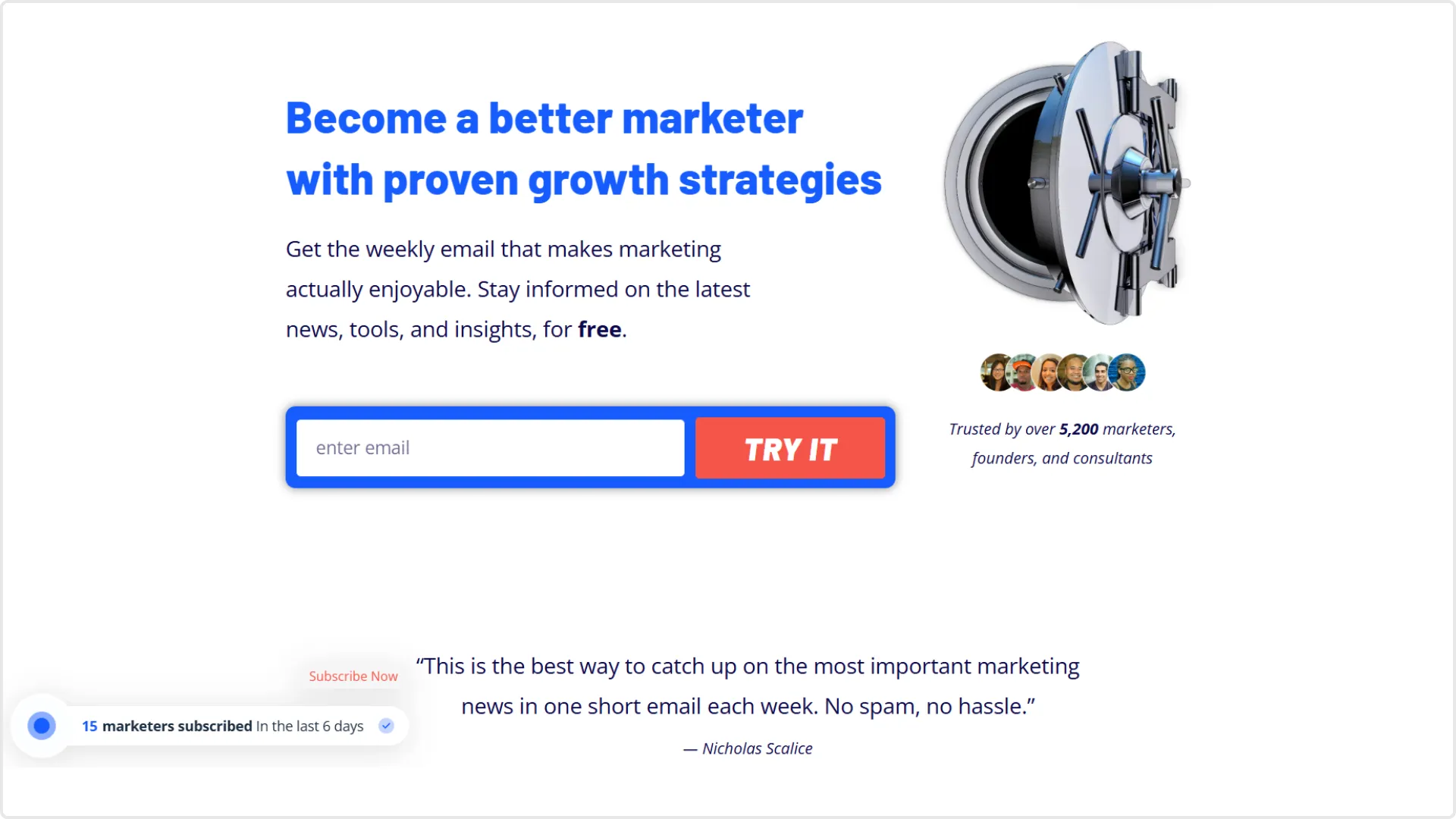
Growth Marketer, a newsletter and blog, also shows real-time social proof popups such as:
“15 marketers subscribed in the last 6 days.”
Example of real-time activity popup on website: GrowthMarketer
When done well, real-time activity popups can be a great way to reinforce credibility because they tap into that "FOMO" inside us, especially for digital products, online courses, or templates. But when they feel fake or overdone (like “David from New York just bought this 10 seconds ago”… every 10 seconds), they start to feel spammy really fast and can seriously undermine trust before a you even have a chance to start a relationship with a potential customer.
Final thoughts
There are lots of ways to show social proof on a website but not all of them carry the same weight. Logo grids, carousels, star ratings are they’re familiar, easy, and they can definitely help. But if you really want people to trust you and imagine working with you, you have to show more than just praise. You have to show proof with context, personality, and a bit of story.
Whether it’s a short case study, a raw Slack message, or a 30-second client video recorded on their phone, the most compelling forms of social proof are the ones that feel real.
If you’re building a new website or refreshing an old one and want to make space for this kind of proof, many of my website templates already do. I’ve designed them with things like case studies, testimonials, statistics and real results baked in, so you’re not stuck trying to retrofit it later.
Over 300 businesses have used my templates to launch their websites faster and look more professional online. Go live in half the time and at a fraction of the cost of custom development, with one of my professionally designed and fully customizable website templates.

.webp)