“My Webflow template was rejected” - Here’s why (and what to do next)
Got the dreaded "your submission fell below our quality standards" email? You’re not alone. This post breaks down why rejections happen more often now, the five major reasons behind them, and what to do next.
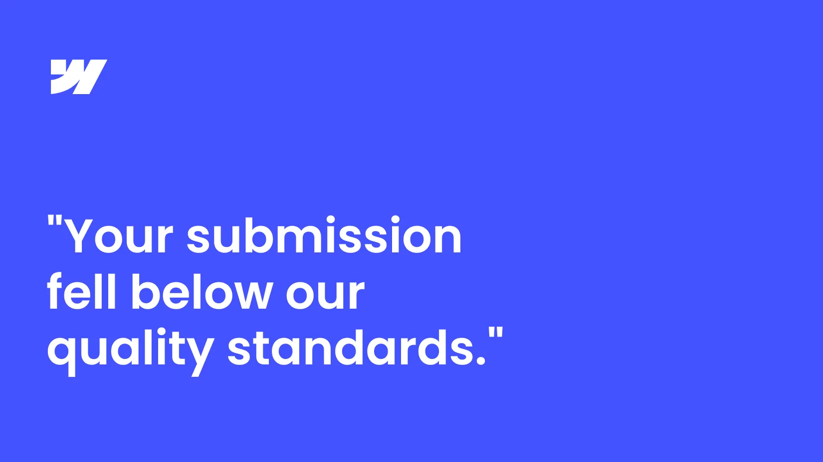
There’s nothing quite like the sinking feeling of opening an email from Webflow and seeing the words: “your submission fell below our quality standards.”
When you submit a Webflow template, you think the hardest part is over…designing, building, and polishing every page. Hitting “Submit” feels like the finish line. But that rejection email is a harsh reminder that it’s not the end of the process…it’s part of it.
If you’ve ever had a template rejected, you’re not alone. I’ve had templates rated Exceptional, others marked Satisfactory (with a to-do list attached), and yes…templates rejected outright. Not once, but three times!
Here’s the important thing though: all three templates that were rejected at first are now published on the Marketplace.
As much as I hated it, those rejections forced me to take a hard look at them and make improvements that made the final versions much stronger than what I originally submitted. In this post, I want to help you cross that same bridge by breaking down the most common reasons templates get turned down, and what you can actually do after you get that dreaded email.
My Webflow template seller journey
I started creating Webflow templates in 2024, after a few years of working on custom Webflow websites for clients. What began as a side project quickly turned into something bigger: I’ve now designed and published over 15 templates across different niches, from SaaS and fintech to agencies and portfolios.
My templates have been bought by hundreds of users worldwide, from solo founders to agencies, who’ve used them as the foundation for their websites. A few of them have even been featured by Webflow on the Marketplace and across their channels, which was a huge milestone for me.
Why am I telling you this? Because I want you to know I’m not speaking from theory. I’ve gone through the process over and over: submitting, getting feedback, improving, resubmitting, and I know how it feels on both sides: the excitement of approval and the sting of rejection.
Like I said, my templates have been rejected thrice. My very first rejection came with the second template I ever submitted. It felt harsh but, honestly, I wasn’t that shocked. I was new to the template creator world and I understood that there was a long way to go.
But the one that really got to me came quite recently, actually, in July 2025. I’d been creating templates for over a year, I had a good track record, and for the most part, things were going well. I’d had multiple approvals, strong sales, and even some recognition from Webflow. I thought I’d figured out my process and finally knew what I was doing.
On top of that, I was genuinely confident and excited about this particular design, in a way I’m usually not about my own work. Which is exactly why the rejection stung so badly.
So when I got that email saying “your submission fell below our quality standards.”, it sent me spiraling. I went through all the negative emotions: from “They don’t know what they’re saying, my template is awesome!” to “Mine is waaay better than these other ones on the marketplace that they approved” to “Wait, is my template actually not that good?” to “Am I not as good a designer as I thought?” Honestly, I’m not proud of this reaction but this is how it went.
Why did my Webflow template get rejected?
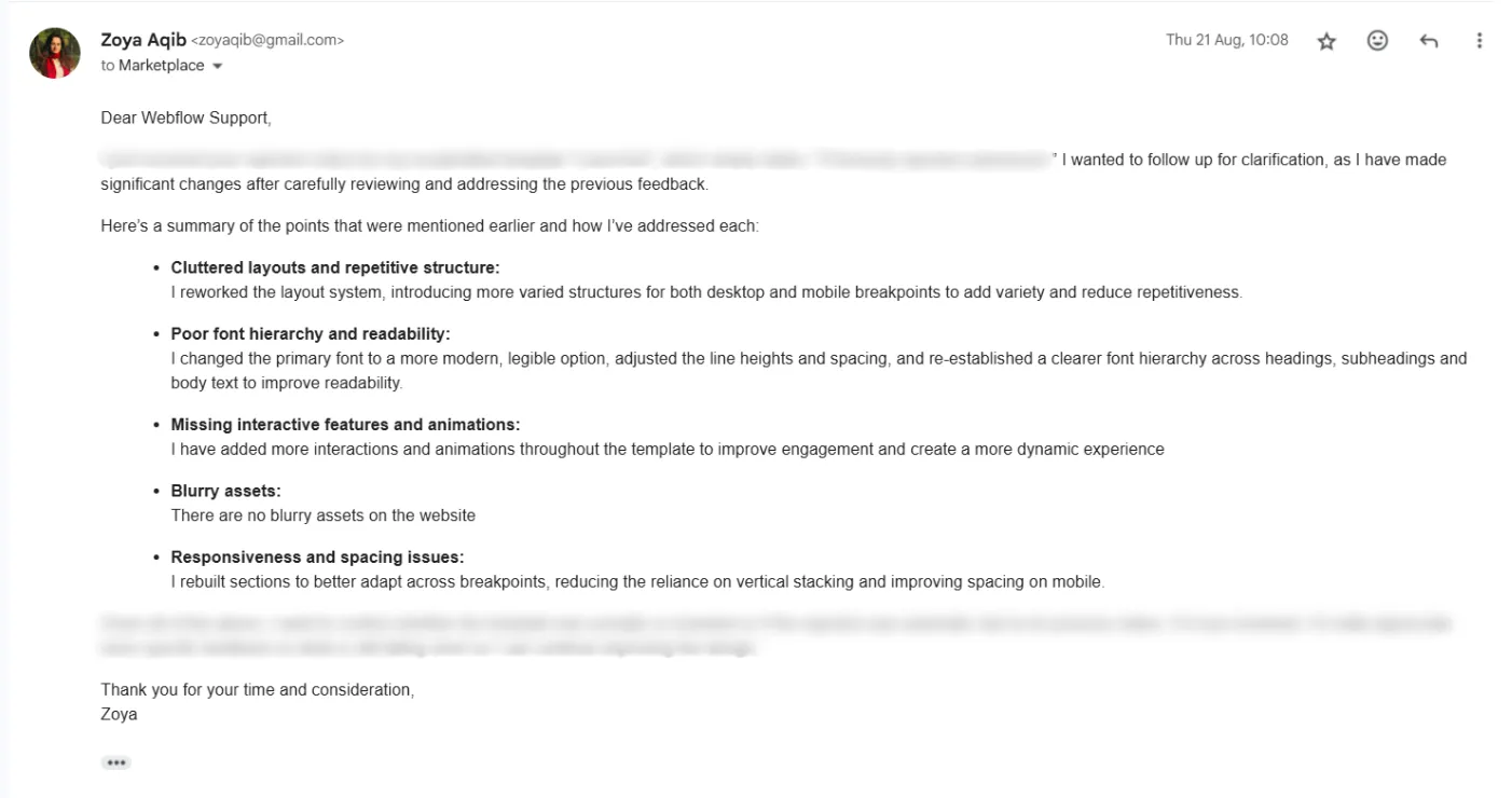
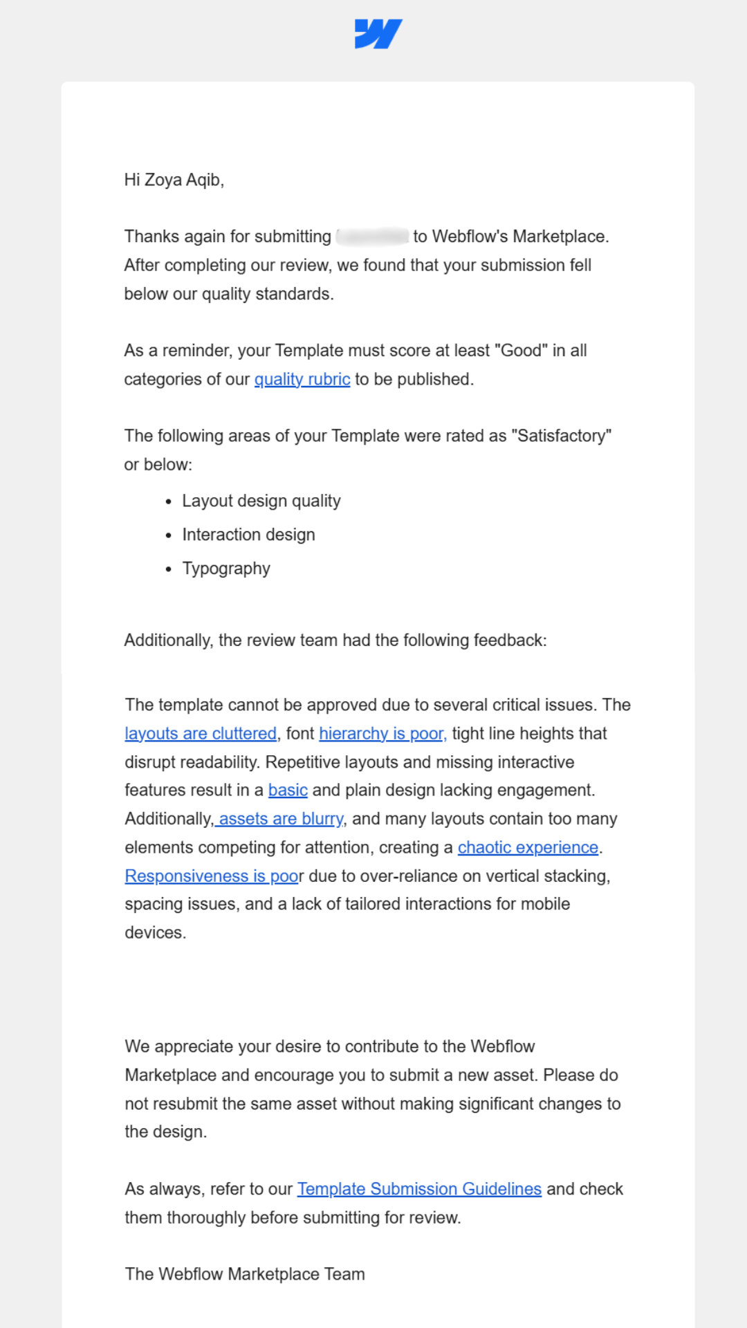
I’ll show you rather than just tell you. I won’t name the template here since it’s approved and live now, but this was the exact rejection email I received at the time. It shows you how detailed (and sometimes blunt) the feedback can be.
Webflow template rejection email
Looking at this email, the feedback was pretty clear: the design quality wasn’t strong enough. The notes called out issues with layout quality, typography, image choice, etc, and that is one of the common reasons that Webflow templates get rejected.
But that’s not the whole story. Lately I’ve noticed more and more creators running into rejections, even when their designs look solid. There are more posts about it in the Webflow and Reddit forums, and I’ve had other designers ask me directly why their submissions didn’t make it.
So while design quality is still the biggest factor, it’s not the only one. Templates that might have been accepted a year or two ago are getting turned down now, and the bar has clearly shifted. In the next section, I’ll break down the five major reasons Webflow templates are getting rejected today, including, but not limited to, design quality.
Top 5 reasons your Webflow template may be rejected
1. Not taking submission guidelines seriously
In Webflow’s own words, “Guideline infringements are the most common reason templates are rejected.”
Now, everyone assumes they’ve got this part covered and they read the requirements thoroughly enough but that’s simply not true. I’ve seen plenty of posts on Reddit and the Webflow forums where creators share their rejected designs, stumped about why they didn’t make it through. And when I look at them, it’s usually obvious: they didn’t take the guidelines seriously enough.
If you didn’t already know, Webflow has a detailed set of submission guidelines that template creators need to follow closely if they want to have their templates accepted and published on the Webflow Marketplace.
Don’t treat the guidelines as suggestions. They’re not optional. They’re absolute must-haves, and you have to follow them to the T. Read the guidelines. Then read them again. Then once more before you hit submit.
And don’t assume the small stuff won’t get noticed or will slip through. Poor contrast on footer link text, a button with too little tap area on mobile, an image “slightly” cropped at a breakpoint…reviewers catch these things. They go through submissions with a fine-tooth comb, and they’re not afraid to reject a template for details you thought were minor.
2. Design quality
Like I said earlier, poor design quality is a common reason that most Webflow templates get rejected. From my experience and the feedback I’ve seen from reviewers, three things get called out the most: layouts, images, and animations. So, here are some tips to get around that:
Image choice and quality
Choose stock images very selectively from high-quality sources like Lummi, Pexels, and Unsplash.
Steer clear of cliché images (like corporate handshakes, staged office lineups, or everyone stacking their hands in the middle). Instead, pick photos that feel natural, modern, and on-brand.
Make sure the images you pick complement your color palette and design theme. Images set the mood for a template and can make or break your design.
Always size images properly: aim for at least 1920px for full-width placements. Small images stretched to fill large spaces will pixelate and immediately downgrade the perceived quality of your design, which is a very common reason for rejection.
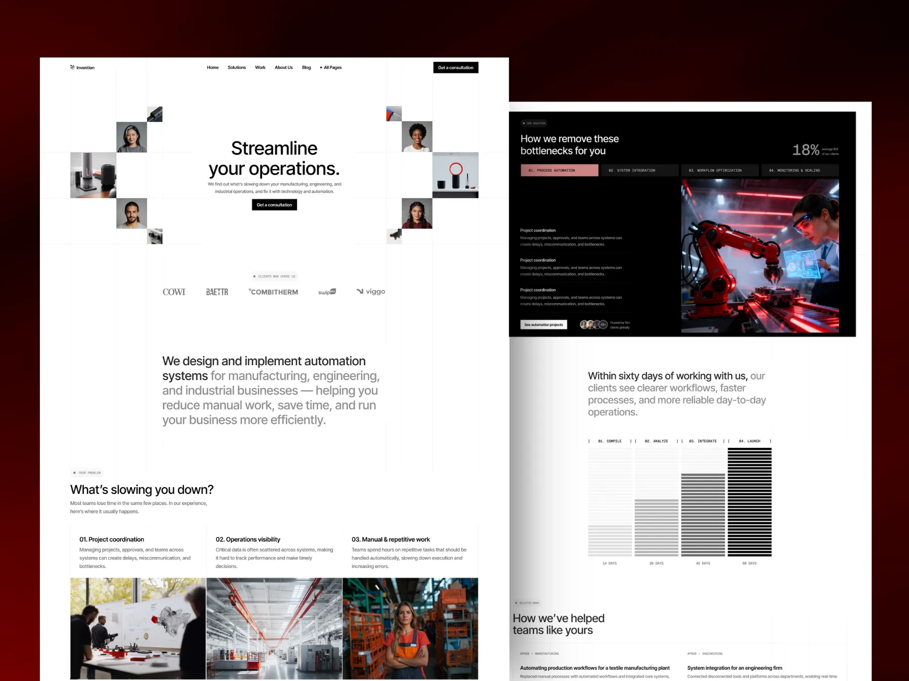
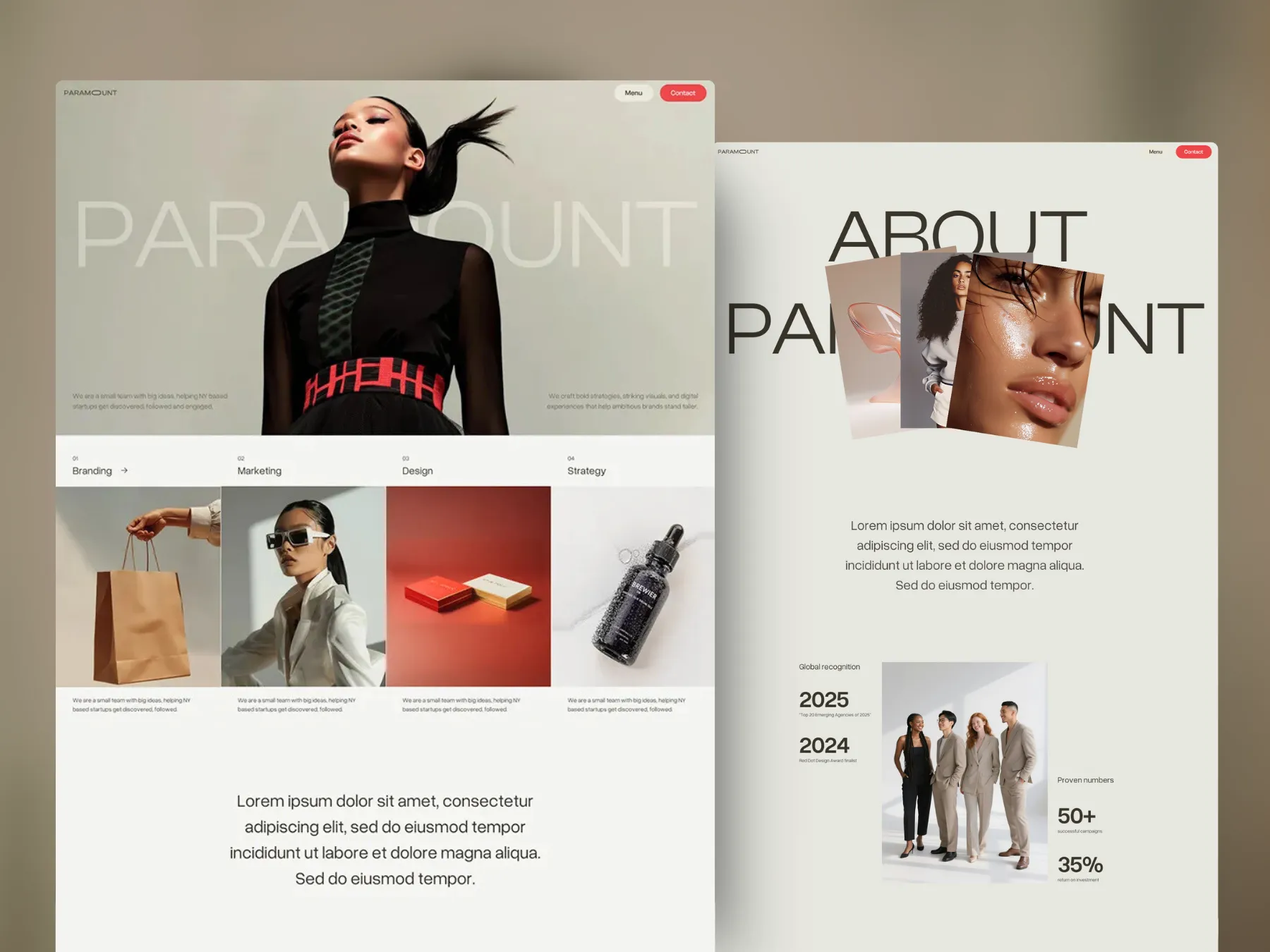
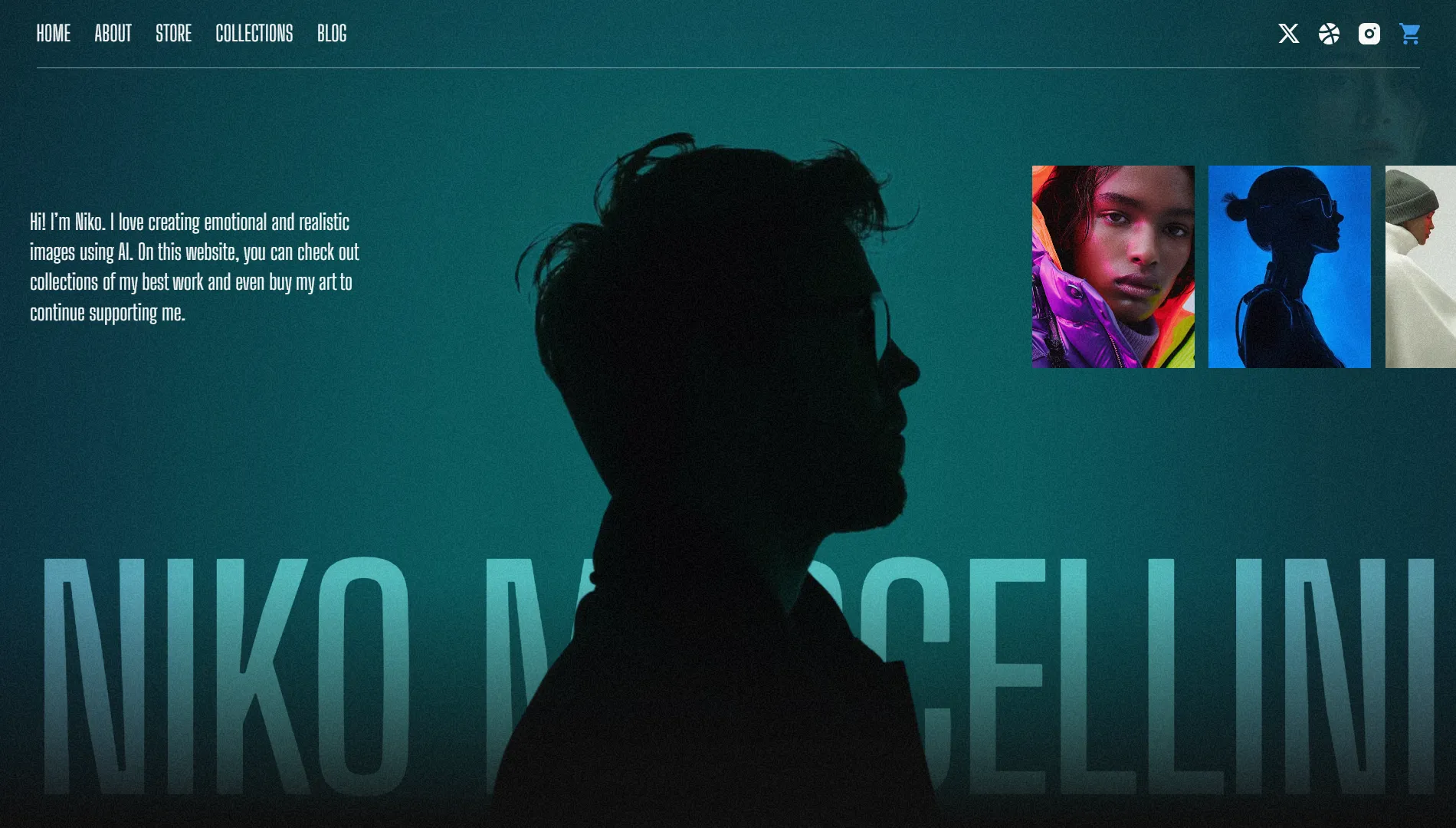
Here is an example of high-quality, on-theme images from Niko, one of my templates that was Featured and rated “Exceptional” by Webflow.
Niko - Featured Webflow template sample with "Exceptional" rating
Layouts
Templates often get rejected when the layouts feel: i) cluttered and overwhelming, ii) too basic and bare, iii) or repetitive from one section to the next. Notice how much this rejection email has to do with layout quality.
Mix up your section structures so the design feels engaging without being chaotic. Alternate between full-width sections, split layouts, grids, and cards.
Make sure every page has at least one or two “hero” moments (a strong hero section, a standout feature grid, or a memorable call-to-action) that makes it stand out.
On mobile, try to avoid stacking every element vertically. Instead, try to add some variety in the form of a slider, carousel, or even a two-column split here and there. One of my templates was actually rejected for relying only on vertical stacking, so that’s something I learned to avoid.
Use spacing carefully and intentionally, and double-check it on small screens. Big, airy gaps that look elegant on desktop can feel way too spread out on mobile. I’ve had rejections where this was specifically called out.
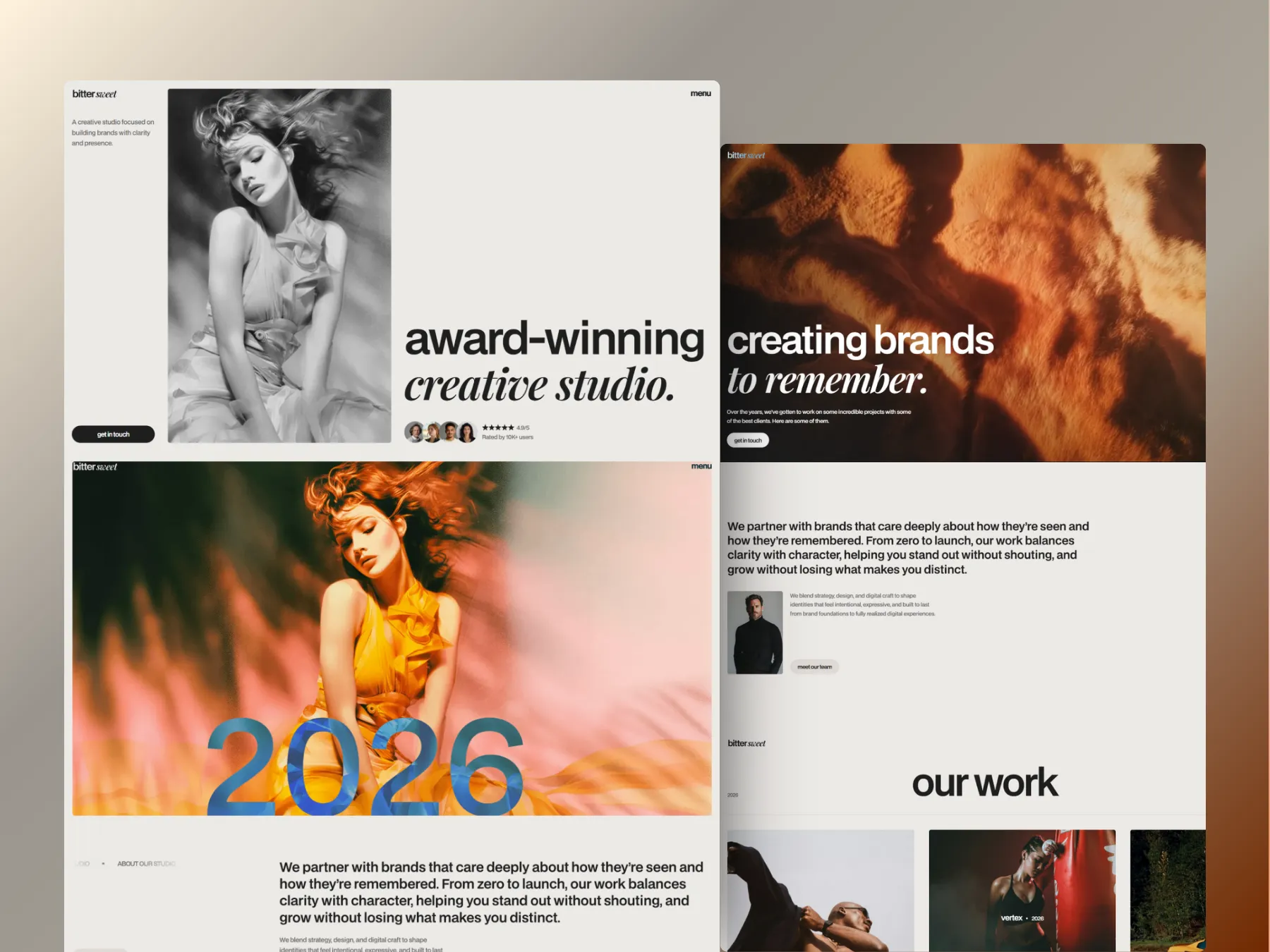
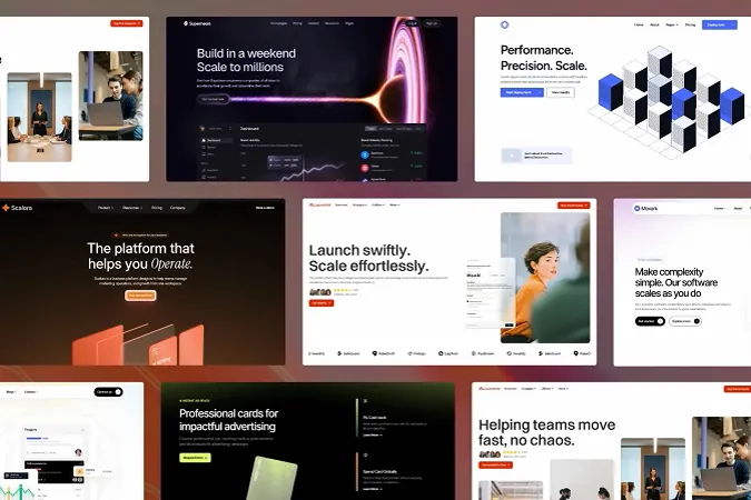
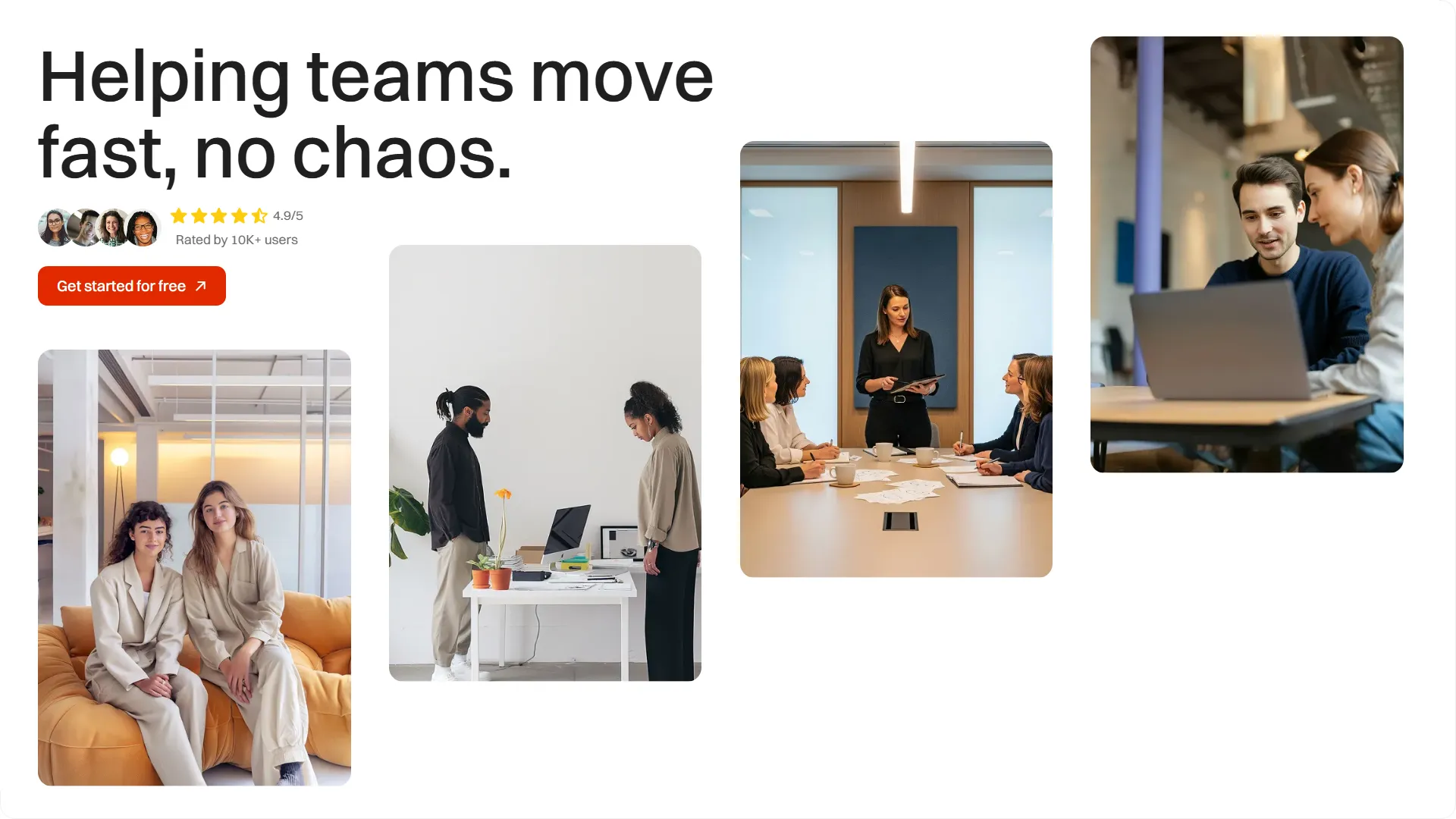
Example of unique layout from a recent SaaS startup template - Launchist
Lack of interactivity or animations
Some creators argue that animations aren’t necessary in every template…..and they’re right in certain cases. But here’s the truth: templates with high-quality and purposeful animations stand out more, get rated higher, and sell better.
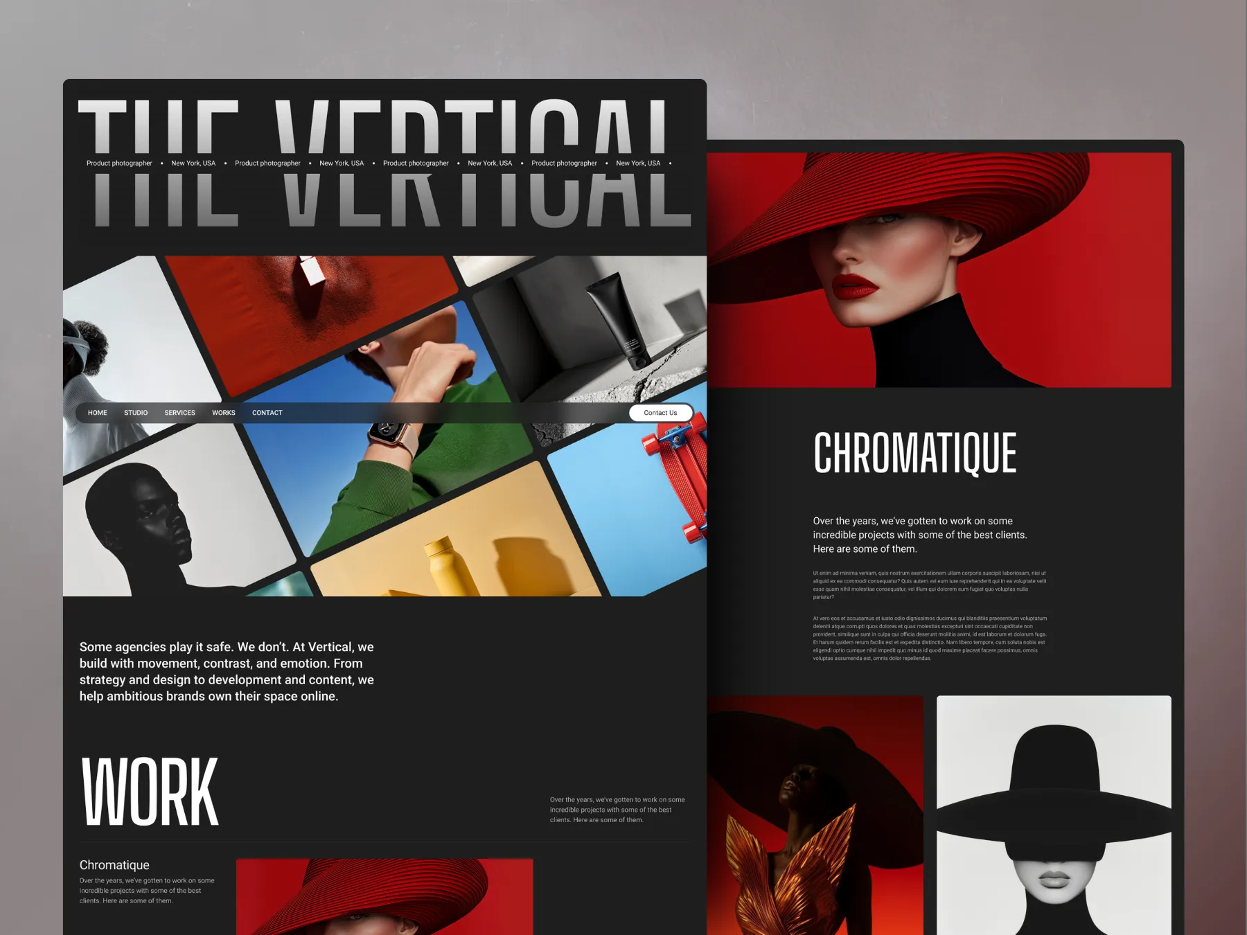
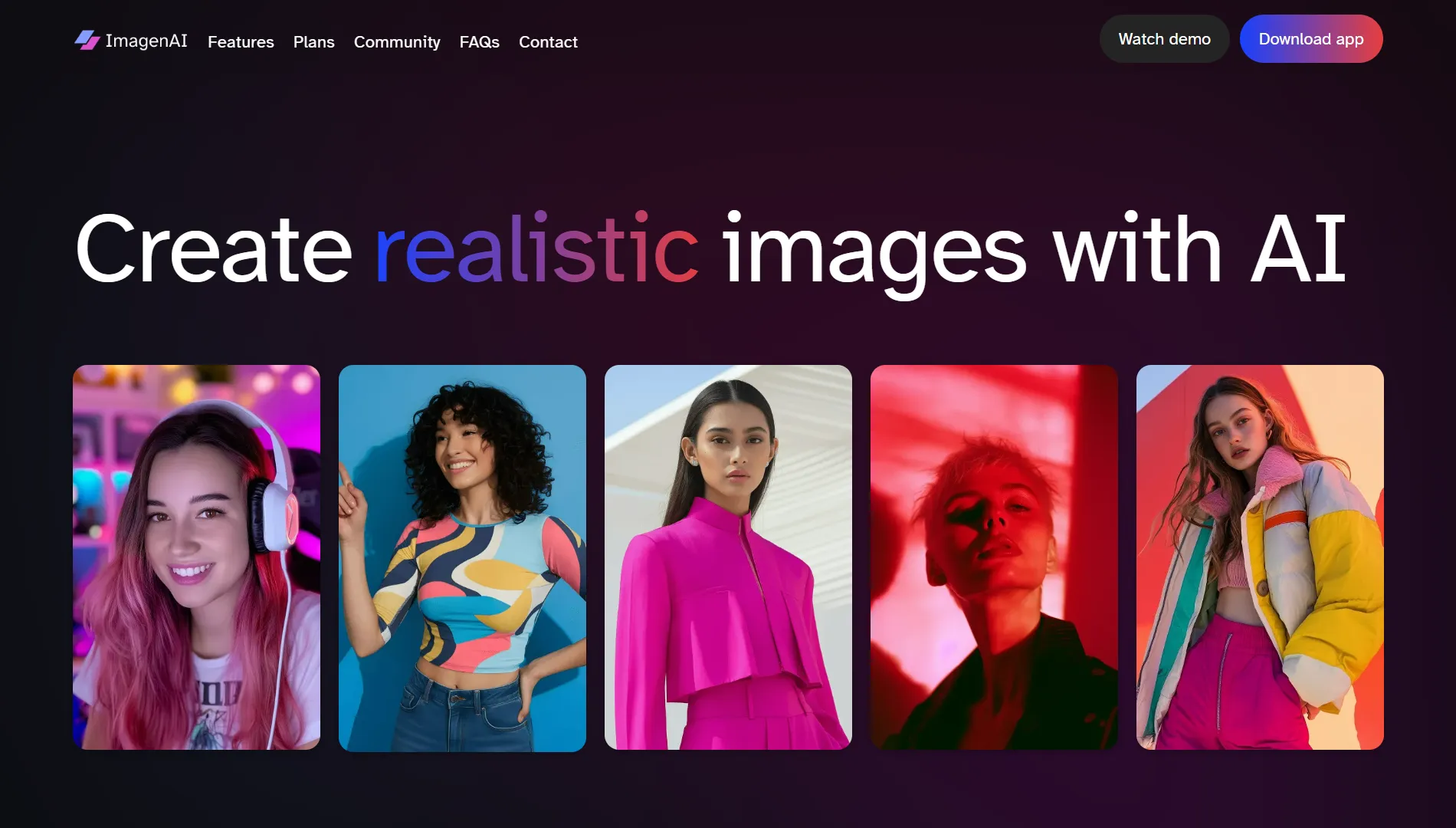
On the home page, always include at least one or two standout animations, since that’s where reviewers focus most closely. Check out this standout example from one of my best selling templates: ImagenAI, which instantly captive visitors with a hero section animation.
Add micro-interactions like hover states on buttons, cards, or links. These small details go a long way in making the template feel polished.
Pro tip: If your design is very minimal or your layouts are on the simpler side, animations can do a lot of the heavy lifting to make it feel “fuller” and more impressive. For example, my template Absolute uses straightforward layouts, but the interactions make it feel interactive and complete, which earned it an Exceptional rating by Webflow.
Here’s a fact for you: there are now well over 7,000 templates published on the Webflow Marketplace and more new ones are being added every day.
That’s a huge jump compared to just a couple of years ago, when the catalog was much smaller and the bar to entry wasn’t as high. Supply has caught up with demand, and Webflow can afford to be extremely selective. The result? Templates that might have been accepted in 2023 or 2024 are now being turned down.
And this isn’t a secret either. Earlier this year, Webflow explicitly shared with its creators that submission volume has doubled and they will now be getting more selective about the templates they accept. Their stated goal? To only approve templates they consider “Exceptional.”
Now, I know this one isn’t entirely on you. The Marketplace is simply more competitive than ever. But is there something you can do about it? Yes. Because Webflow’s reviewers are no longer just looking for “good” designs. They’re looking for something that feels spectacular, that has that wow factor. So let's talk about that next.
4. No “wow” factor
Reviewers look at dozens of template submissions, and they make an impression fast, usually within the first few scrolls of the homepage. If your template doesn’t have something that immediately grabs attention, it risks being seen as too plain or unremarkable.
Now, some creators argue a template doesn’t need to “wow.” It just needs to be functional, practical, and easy to customize for buyers. And while usability absolutely matters, I hate to tell you, that won’t cut it in 2025. A clean, simple template that gets the job done might have been approved a year or two ago, but now it needs to feel polished and have that extra spark.
If you look at the Featured templates section on the Webflow Marketplace, more often than not you’ll see designs that offer a degree of interactivity and engagement, not just clean, simple layouts. While the “wow” factor used to be a nice-to-have, it’s now almost a necessity if you want your template to get approved.
This doesn’t mean you need over-the-top animations or wild design choices. But it does mean your template should feel polished, intentional, and a step above “average.” A strong hero section, a clever layout choice, or an interaction that feels just right can often make the difference between a rejection and an “Exceptional” rating.
5. Too similar to other templates
One of the quickest ways to get rejected is to submit something that looks almost identical to what’s already on the Marketplace. Webflow doesn’t need another SaaS homepage with the same two-column hero, the same three-column pricing grid, and the same pricing cards in slightly different colors.
Reviewers are actively looking for variety. If your design feels like a remix of five templates that already exist, it won’t make it through, even if the execution is solid. They want fresh ideas, new layouts, and templates that fill genuine gaps in the catalog.
This is why research is just as important as design. Before submitting, scan the categories your template would fall under in the Webflow Marketplace. If you can’t immediately explain how yours is different (and better), chances are it won’t survive the review process.
Creating and Selling Webflow Templates in 2026
A practical guide to turn your Webflow skills into a product-based income stream.
When you receive a rejection, the initial response is almost always personal. You feel like the rejection says something about you as a designer, not just about that one template. My advice is: let yourself feel it for a day if you need to, but then separate yourself from the work. A rejection isn’t a verdict on your skills or your career…it’s feedback on a single submission.
And here’s some good news: Webflow now provides detailed feedback when they reject a template. That wasn’t always the case. Early on, a rejection just meant “no” without much explanation, which left you guessing at what went wrong. Now, you get clear notes that point you in the right direction, and that’s honestly a gift.
That feedback is the best starting point. Once you’ve had a moment to breathe and get past the personal side of rejection, use those notes as your guide.
1. Break down the reviewer feedback
Don’t just skim the notes. Turn each point into a to-do item and tackle them one by one. Use the tips I shared earlier in this post (images, layouts, accessibility, interactivity, responsiveness) as a guide while you make improvements.
2. Get a fresh pair of eyes
After working on a design for weeks, it’s almost impossible to look at it objectively. Ask another designer if possible, but even showing it to a friend or family member can surface useful feedback. You’ll be surprised at what fresh eyes catch.
3. Study the featured templates
Spend time looking at the templates Webflow features on the Marketplace. These are the gold standard because they show you exactly the level of polish and creativity Webflow wants to see.
4. Refine and resubmit
Once you’ve made your updates, send it back in. In your resubmission email, respond to the reviewer’s notes point by point and explain how you addressed each one. It shows you took their feedback seriously and makes their job easier, which only helps your chances. Here’s a sample from one of my responses after a template got rejected.
Webflow rejection email response and resubmission after changes
TL;DR - Key takeaways
Rejection happens to everyone, even experienced creators including me. I’ve had three templates turned down, all of which later got approved.
Failure to strictly follow Webflow template submission guidelines is the #1 reason templates get rejected.
Design quality needs to be extremely strong. Weak layouts, poor images, or lack of polish will sink you fast.
Competition is fierce. With over 7,000 templates live, Webflow is only accepting what it considers “Exceptional.”
Reviewers want a wow factor. Clean and functional isn’t enough anymore. Templates need something that feels premium. Consider adding more varied layouts and impressive animations to help your templates stand out.
Action plan after rejection: Break reviewer feedback into a checklist, get fresh eyes on your design, study featured templates, and resubmit with clear notes on what you fixed.
Over 300 businesses have used my templates to launch their websites faster and look more professional online. Go live in half the time and at a fraction of the cost of custom development, with one of my professionally designed and fully customizable website templates.


.webp)